

TOROCIMA
Brand Identity + Mobile App
Spring 2023
Josué Avalos Jiménez
Nick Ciraolo
Alex Jackan

Overview
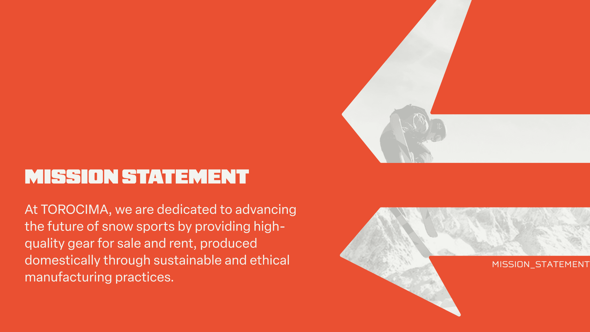
Torocima is a third-party snow sports rental company built for newcomers, part-timers, and people with physical disabilities, designed to cut hours of in-person renting down to minutes. For my sophomore capstone project at NC State GXD, I led the brand identity and product design system while collaborating on UX research and prototyping. The result is a full brand world, from mythology-rooted logo system to a 17-icon custom set and a complete mobile app prototype.
01 · The Name
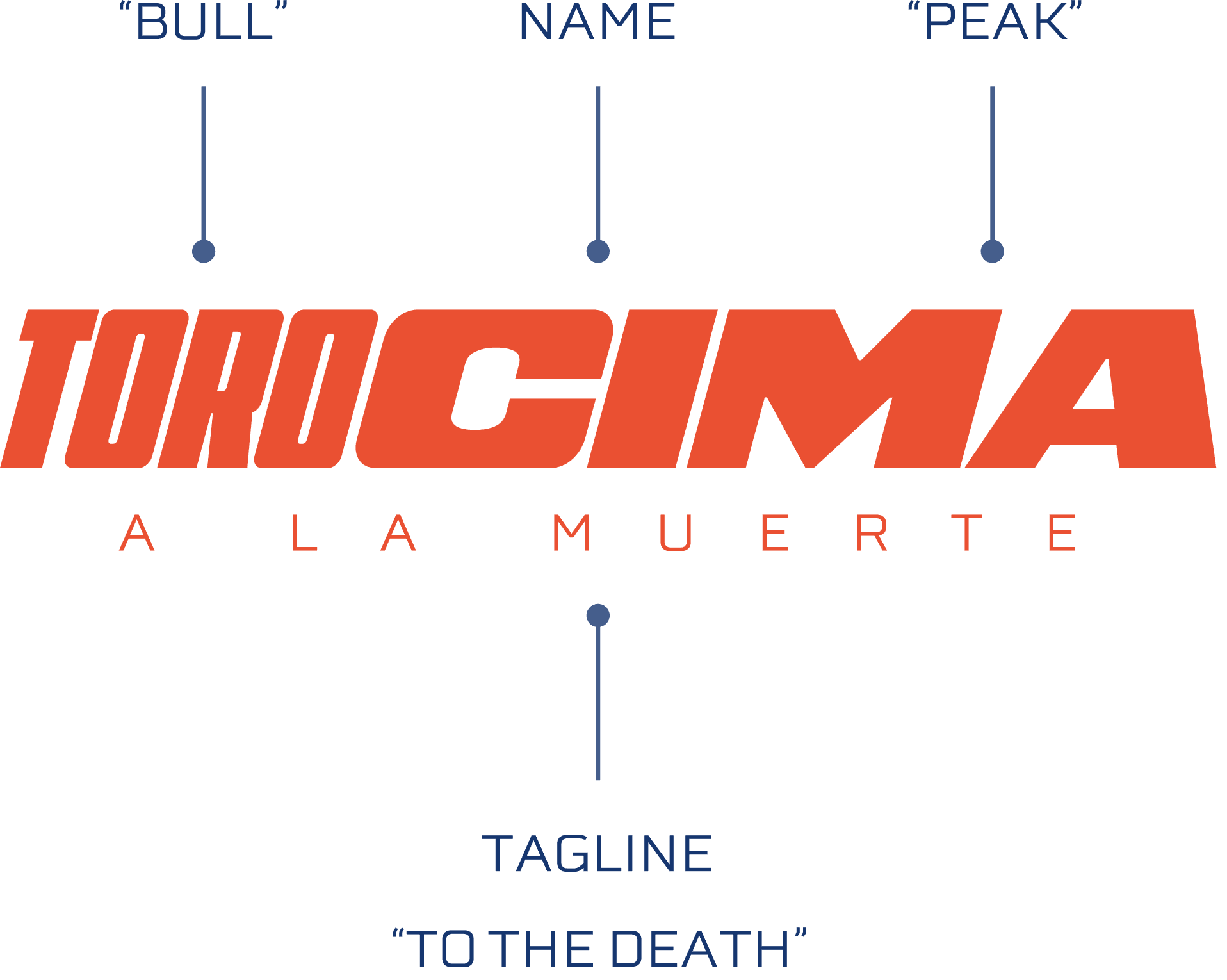
The name comes from two Spanish words: Toro (bull) and Cima (peak). Together they reference the Camahueto, a bull-unicorn creature from Chilote mythology in southern Chile. We set the company in Chile intentionally, drawn to the culture and the Andes as a landscape. The tagline — A La Muerte, "To the Death" — leans into the extreme sports tradition while the brand takes itself seriously underneath it. We wanted Torocima to feel like it could stand next to any legitimate outdoor brand.
02 · Identity System
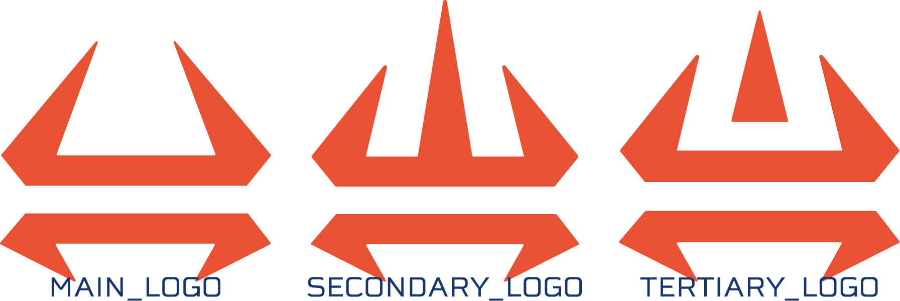
The mark abstracts the Camahueto's horns into a geometric icon that doubles as a mountain silhouette. I developed three logo variations: a primary mark, a secondary, and a tertiary, each maintaining the same angular "cut edge" design language. That geometry became the DNA for everything that followed: the icon set, UI components, and the pattern system derived from tiling the marks.


03 · Color
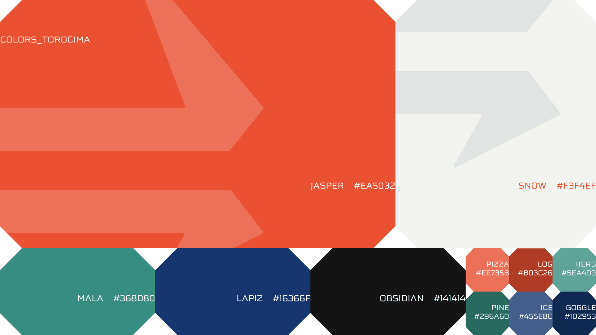
The palette draws from the mineral ores found in the Chilean Andes. Each color was named for its source: Jasper (our primary Torocima red) anchors the brand, supported by Snow, Mala, Lapiz, and Obsidian as the core system. Secondary colors (Pine, Ice, Goggle, Pizza, Log, Herb) extend the palette for UI states, accessibility indicators, and product categories. Jasper is used sparingly in the UI, reserved for moments of action and emphasis, which makes it hit harder when it appears.
04 · Typography
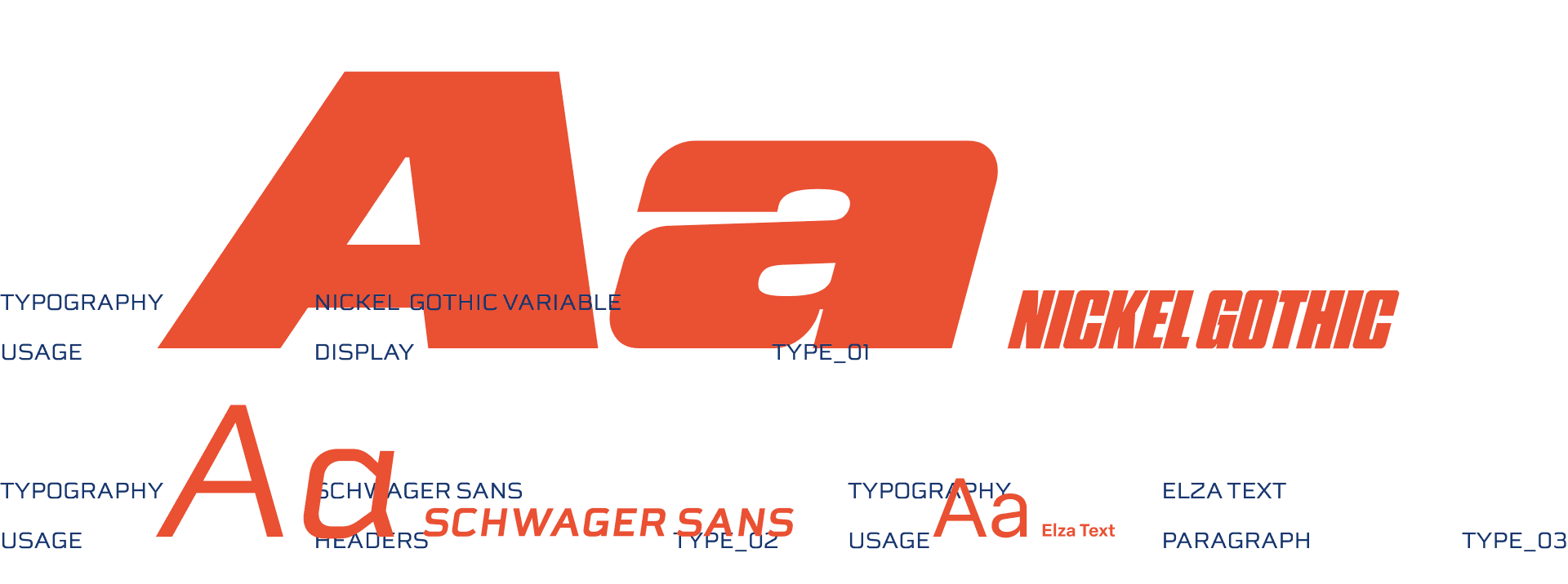
Three typefaces, three distinct roles. Nickel Gothic Variable handles all display and brand-level type; its condensed weight and aggressive italics carry the energy of the mark. Schwager Sans steps in for headers across the UI, bridging between brand and product. Elza Text handles body copy, keeping the reading experience clean and accessible at small sizes. The display font was deliberately kept out of the mobile app; it reads beautifully large but loses legibility at UI scale. We wanted to prioritize usability and accessibility while still pulling from our bold style.
05 · Iconography
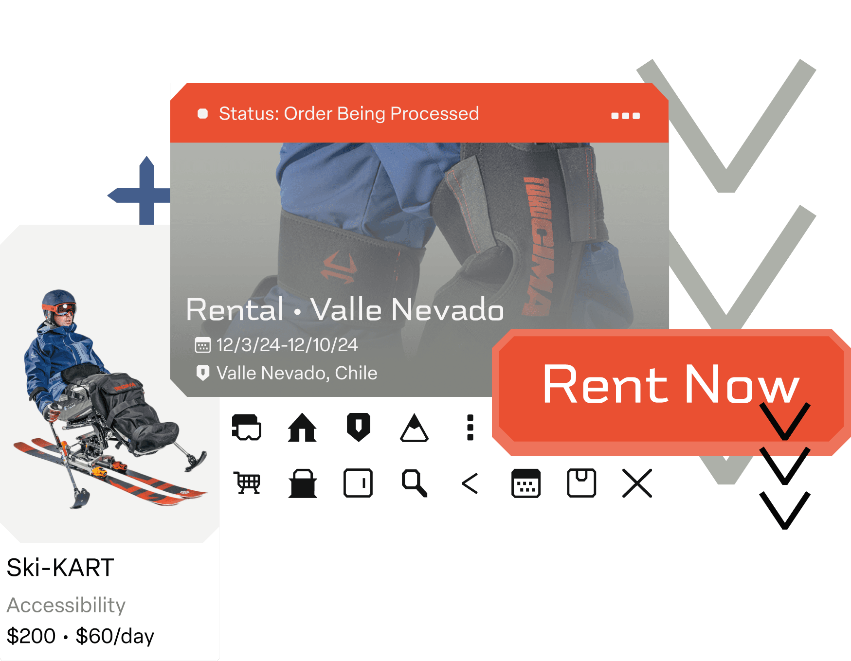
I drew 17 custom icons following the same cutting-edge geometry as the logo. Each icon has a filled and an outline state for selected and unselected UI conditions. The icons cover all primary app functions (navigation, store, rentals, accessibility, calendar, search) and were designed to read clearly at small sizes while still carrying the brand's angular character. The goggles icon became a key (and cute) visual anchor across the system.



06 · Research
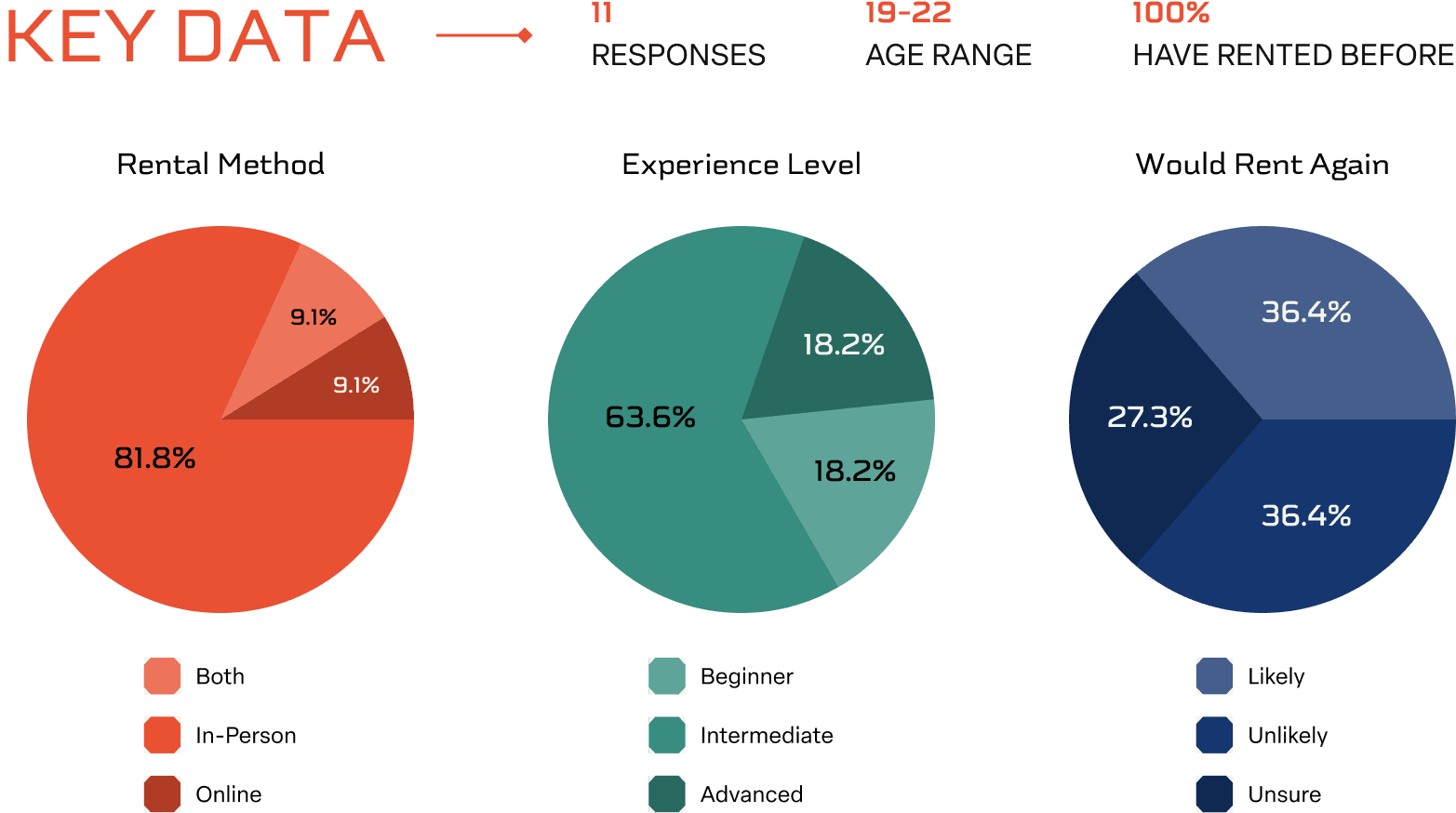
Our design challenge: "How might the design of a snow sports company's mobile app help people with physical limitations rent equipment more easily?" We started with user surveys, learning that the majority of potential customers were new to snow sports and 81% had rented in-person, but only 36% said they'd likely rent again. Long lines and complicated paperwork were consistent pain points.
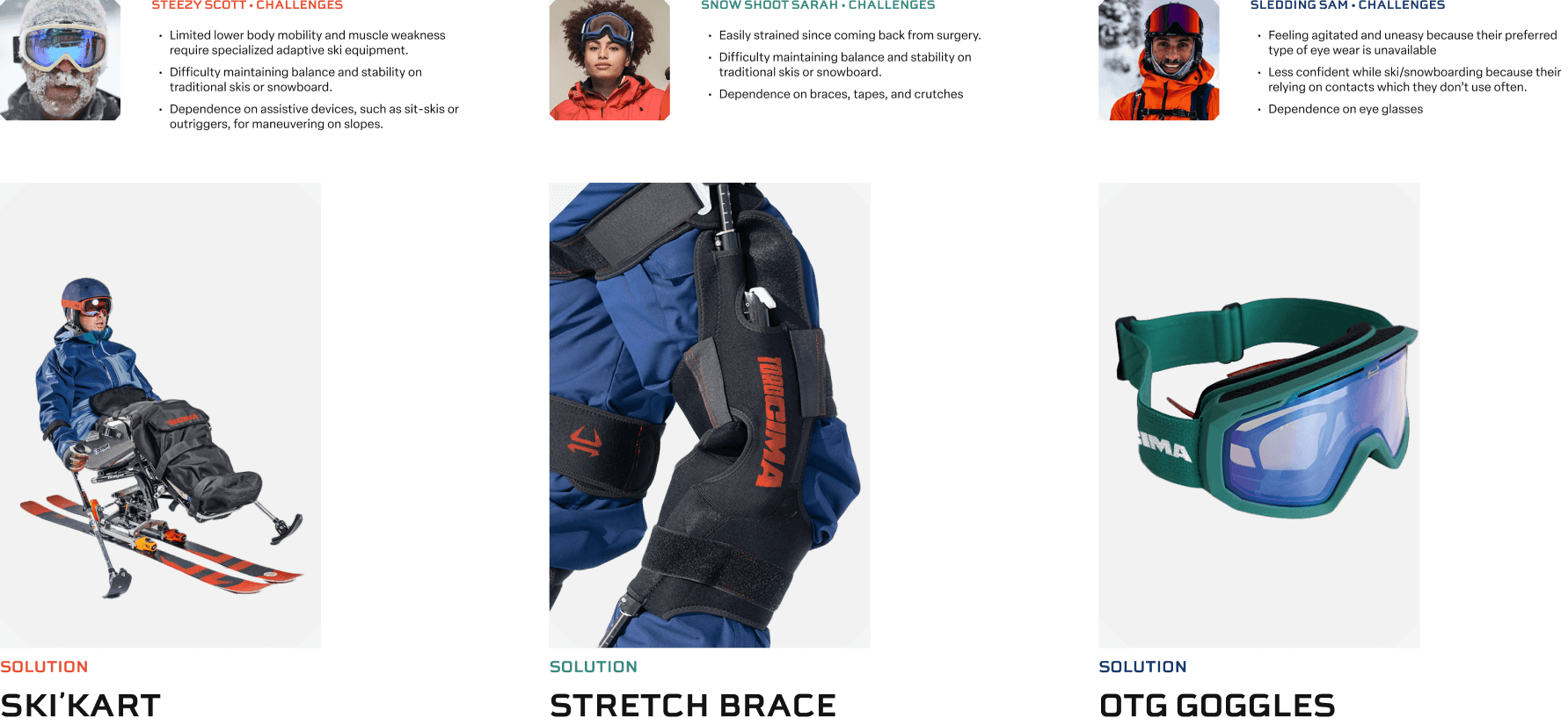
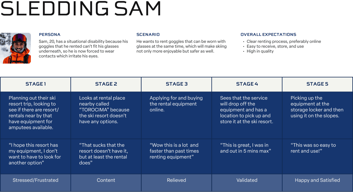
We used a Persona Spectrum to map physical limitations to specific equipment solutions: a Ski-KART for mobility constraints, a knee brace, and OTG (over-the-glasses) goggles. User journeys mapped the emotional arc of renting from each persona's perspective, surfacing weak points in the current process.
07 · Product
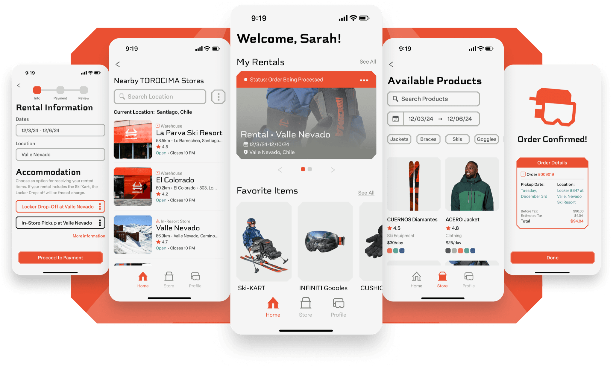
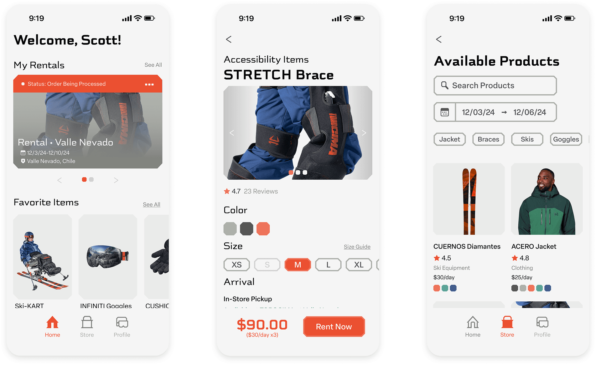
The app streamlines the rental process into three steps: choose a store location, set rental dates, and select products. The design system I worked on (25+ components, 54 component variables) ensured the brand translated consistently into every UI state. The Ski-KART accessibility flow became a centrepiece feature: users with mobility constraints can opt into free locker delivery at their resort, a feature that was later extended to all users.
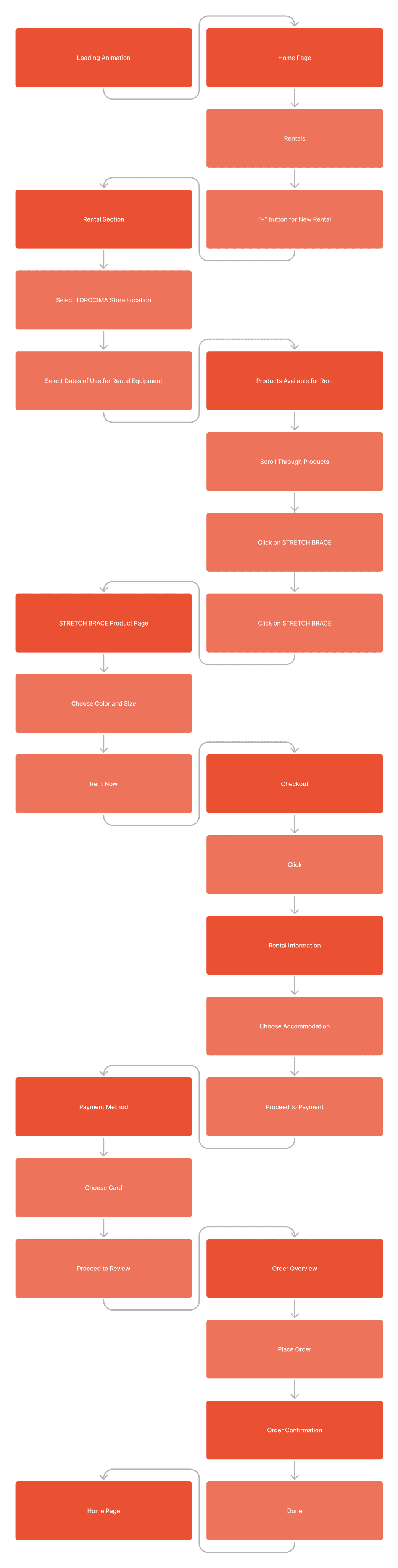
Those three steps are the middle of a longer path. The full rental flow runs from the loading animation to order confirmation, and the two shapes in it are the point: the darker boxes are screens, the lighter ones are what the user does, so every screen is earned by an action rather than assumed.
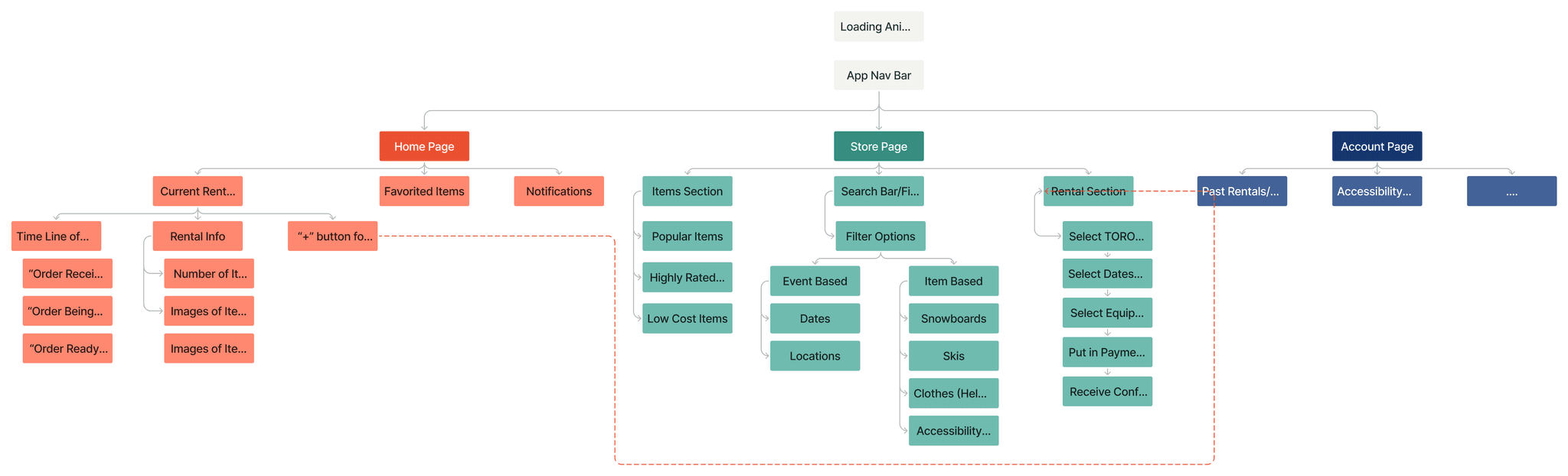
The architecture underneath it splits three ways: Home for what you are already renting, Store for finding equipment, Account for everything after. Accessibility sits as a filter inside the store rather than as a separate path, which is the decision the Ski-KART feature rests on.
After testing with five users, we learned that emphasizing the product image in the rental confirmation ticket performed better than showing the store photo, that adding text to action buttons reduced confusion, and that a checkout timeline significantly increased user confidence during purchase.
Reflection
Torocima is still one of my favorite projects. It's the first time I built a brand from true zero, mythology, naming, geometry, color, type, motion, icons, UI, and felt every piece connect to a single idea. I learned that accessibility isn't a constraint; it's a design feature that makes the product better for everyone. I also learned what it means to design a system versus designing a screen. The Ski-KART feature, going from persona spectrum to interactive prototype, felt like proof that user research and visual craft are the same conversation.