

StatBar
Mobile App + Design System
Spring 2025
Josué Avalos Jiménez (kelpbro)
Overview
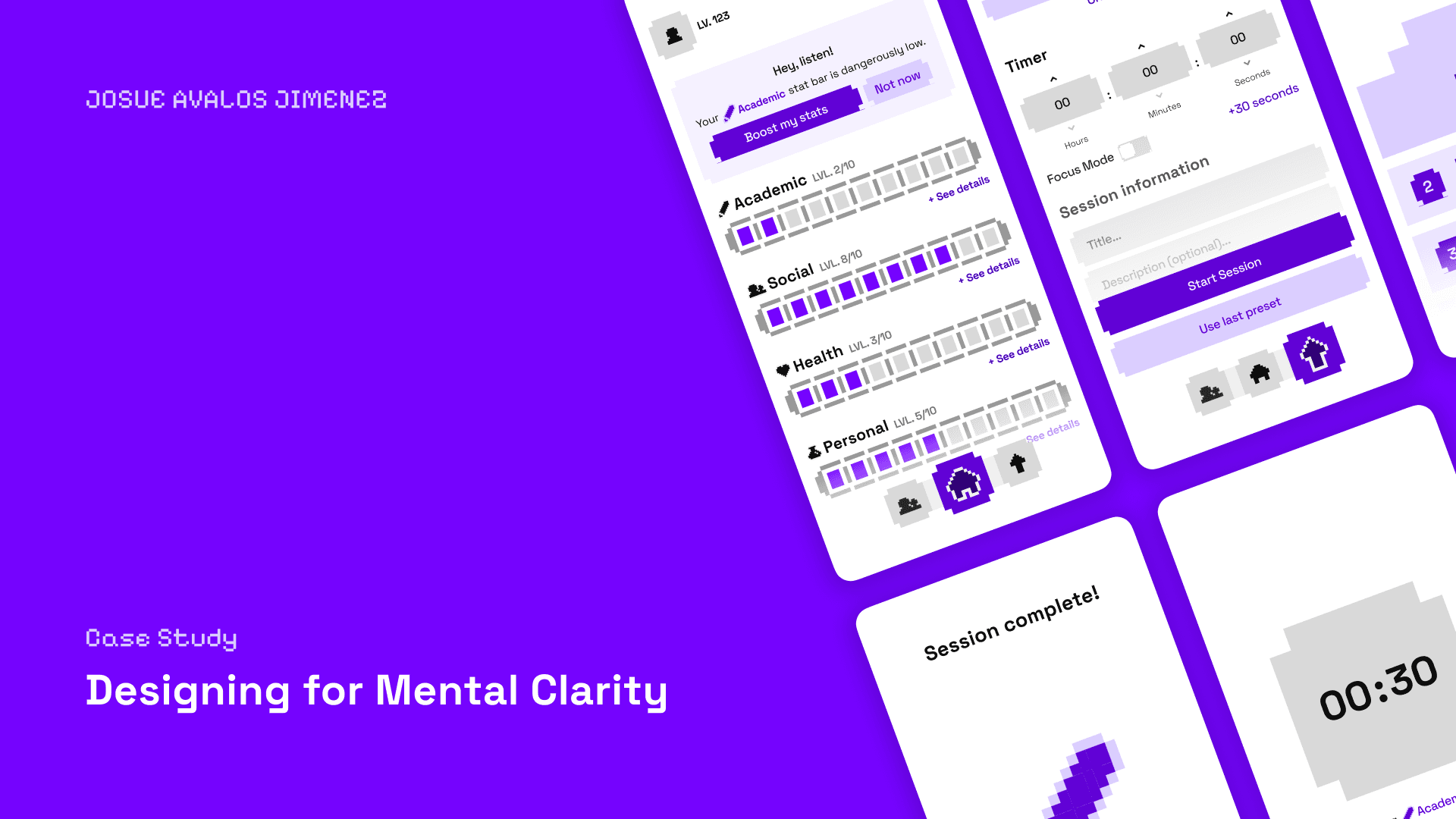
StatBar is a mobile app concept that turns the experience of managing your life into something that feels like a video game. Track your Academic, Social, Health, and Personal stats through a retro-inspired pixel UI, complete with XP bars, focus sessions, nudges, and a reward screen when you finish grinding.
Built solo for Advanced Graphic Design Studio in roughly two weeks, the project was less about shipping a perfect product and more about figuring out what a gamified self-management tool could look and feel like. The design system (pixel icons, bouncy components, glowing stat bars) ended up being the real output. The app logic is still catching up.
P.S. Yes, my username is Kelpbro.
01 · Research
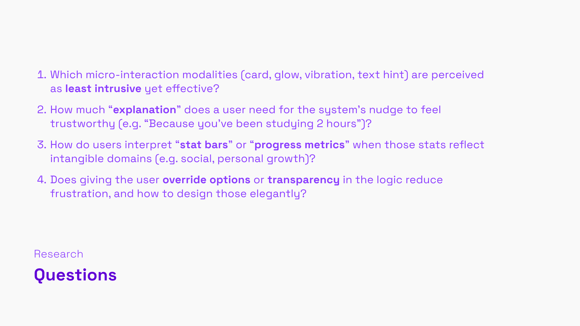
The brief asked for a subtle, intelligent tool that helps users reduce mental clutter and make better decisions without adding to the noise. The challenge I set for myself: what if we gamified the stressful experience of managing life's competing demands?
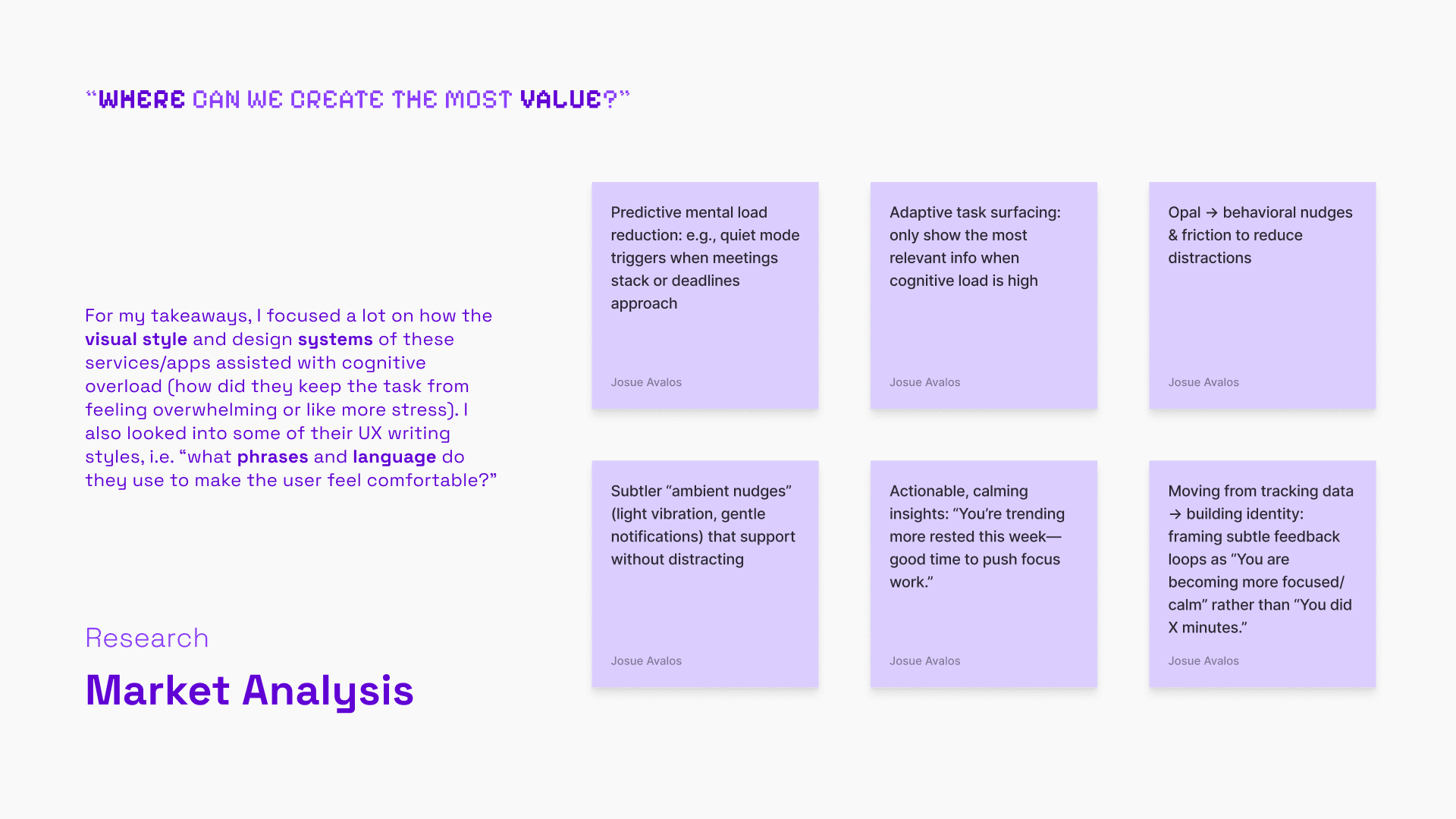
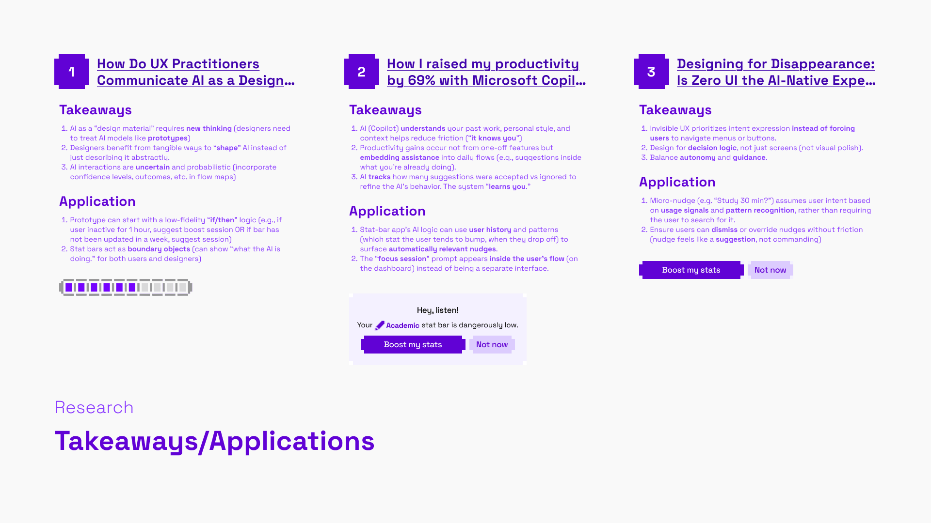
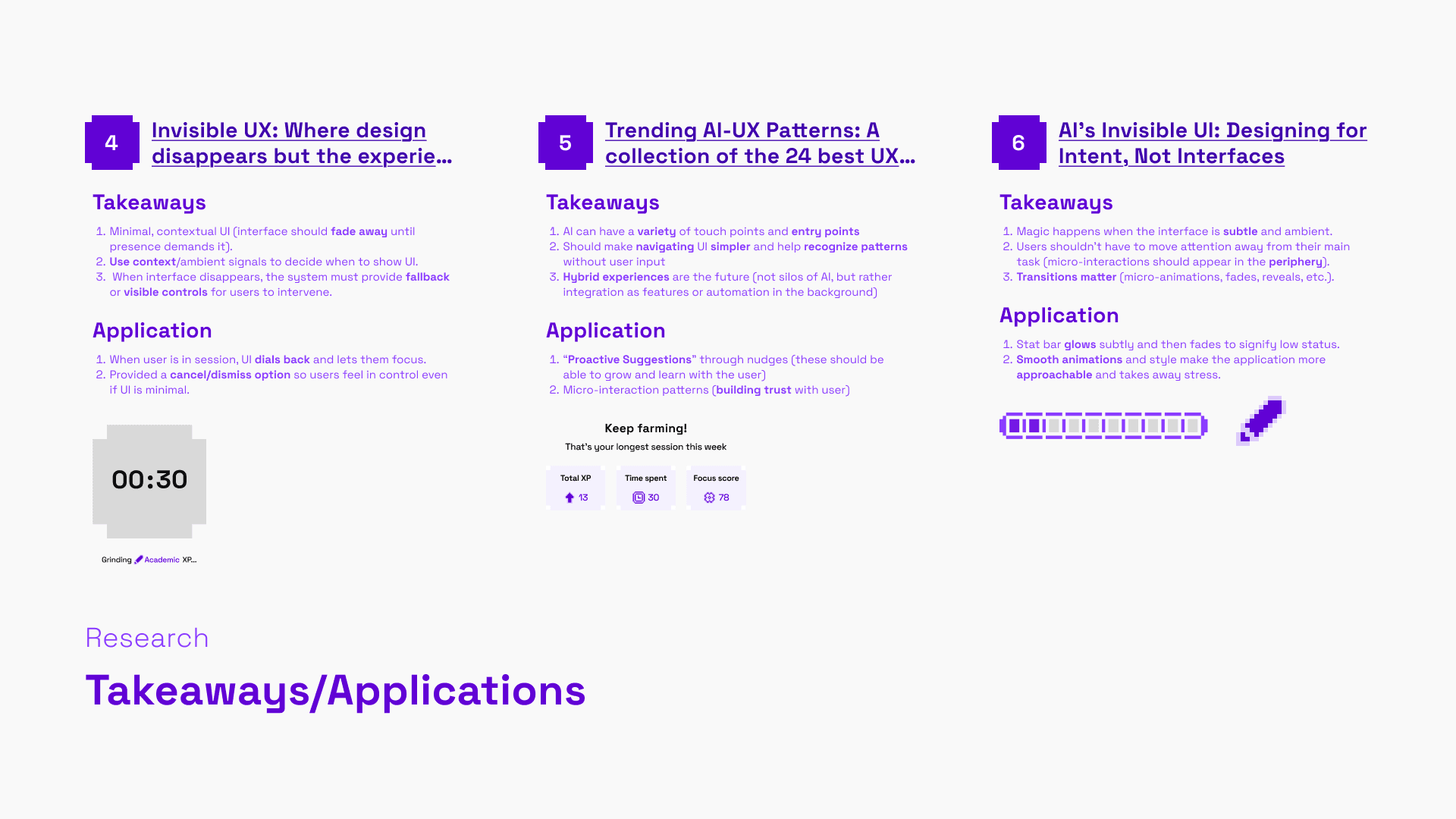
Research pulled from six articles covering invisible UX, AI-native design patterns, and productivity tools. A few things that stuck: the best nudges live inside the user's existing flow rather than interrupting it; systems should feel like suggestions, not commands; and progress framing ("you're becoming more focused") lands better than data framing ("you did X minutes"). Competitive analysis looked at Headspace, Calm, Oura Ring, and Apple Health, mostly studying how their visual systems either added or reduced cognitive load, as well as what language they used to make users feel in control.
The core opportunity was predictive, ambient nudges that surface the right stat at the right moment, without the user having to search.
02 · User Experience
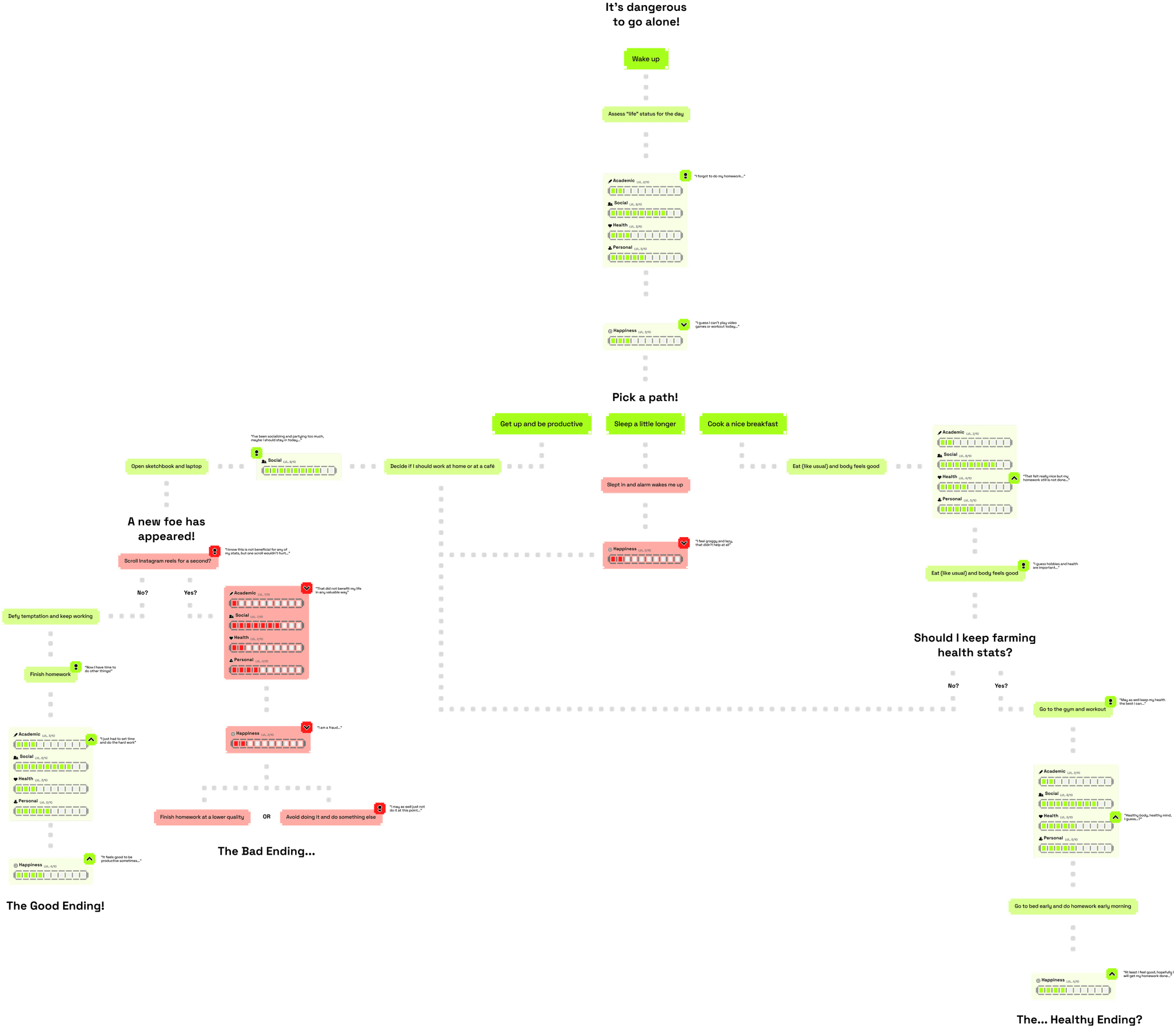
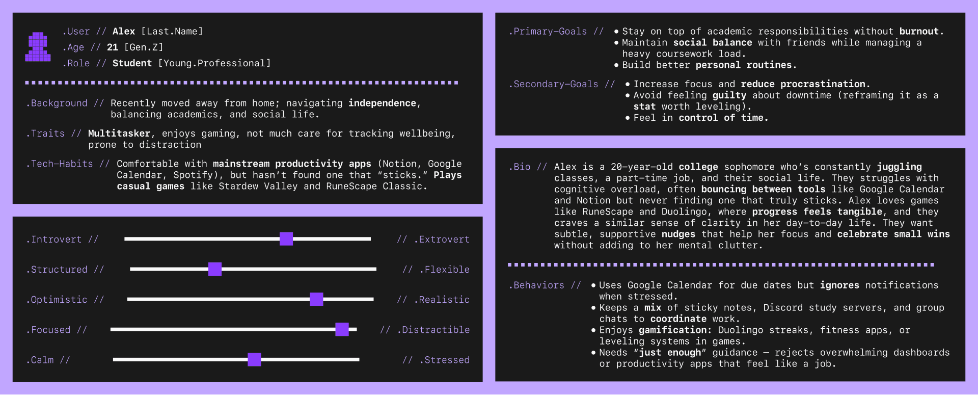
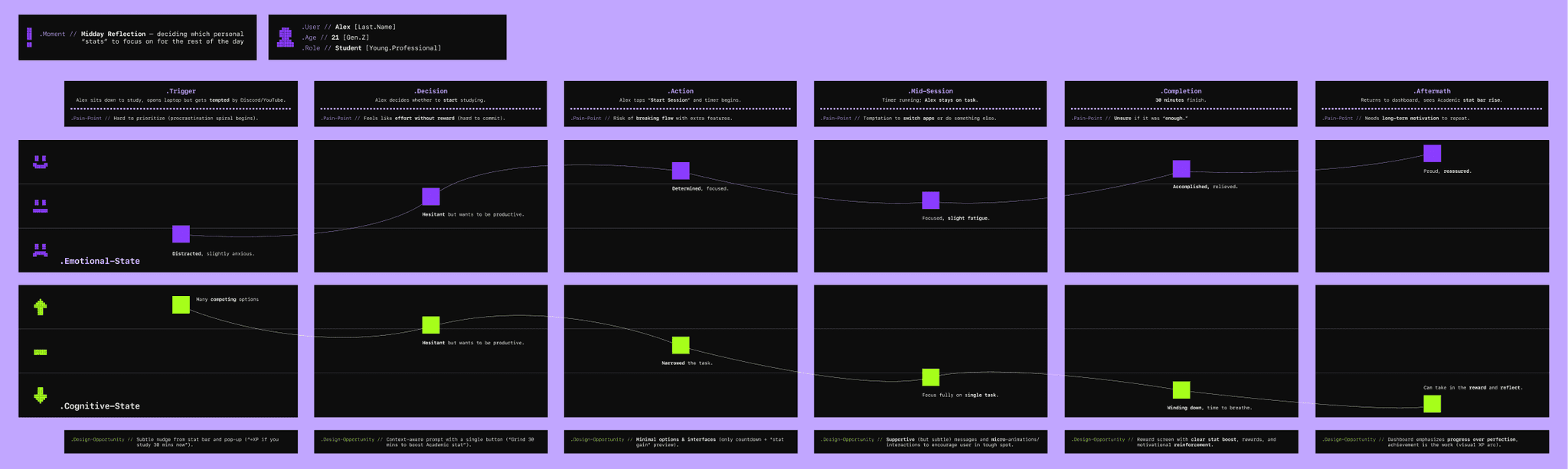
The persona I designed for was Alex, a 21-year-old college student prone to distraction and juggling too many tabs. It came partly from research and partly from a cognitive map exercise where I mapped how I actually manage tasks day-to-day. I realized that I play too many video games. I treat areas of life like RPG stats and feel the pressure of keeping them all leveled up at once (I am boosting my portfolio stat right now). That's where the four core stats (Academic, Social, Health, Personal) came from. Users can also add custom stats.
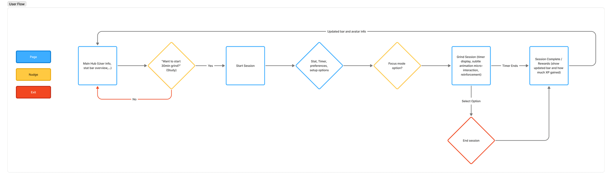
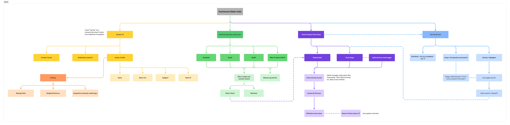
The cognitive map turned into something pretty fun: a branching JRPG-style decision tree for a single day, complete with "The Good Ending," "The Bad Ending," and "The... Healthy Ending?" as outcomes. The exercise captured the actual emotional texture of trying to be a functional person better than a standard journey map would have. The user flow and lo-fi wireframes keep it tight (dashboard nudge, session setup, timer, reward screen, stat update, loop). If you’re on mobile, don’t even try reading the map.
03 · Design System
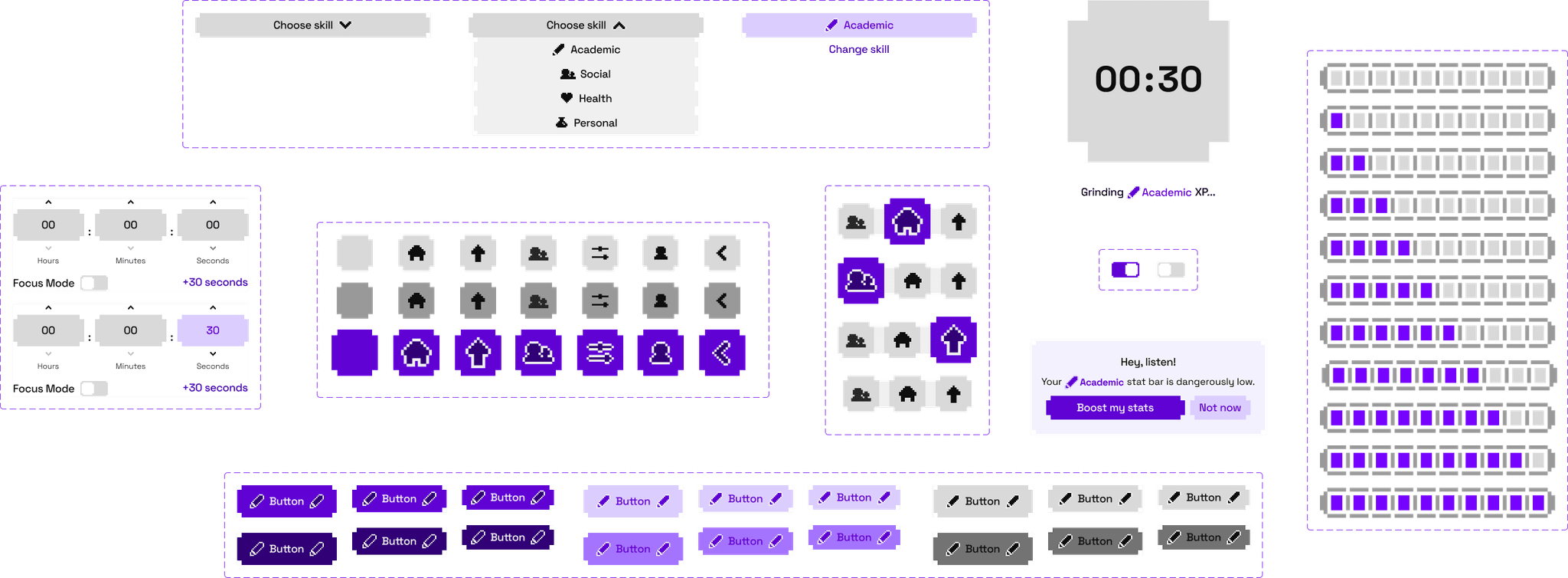
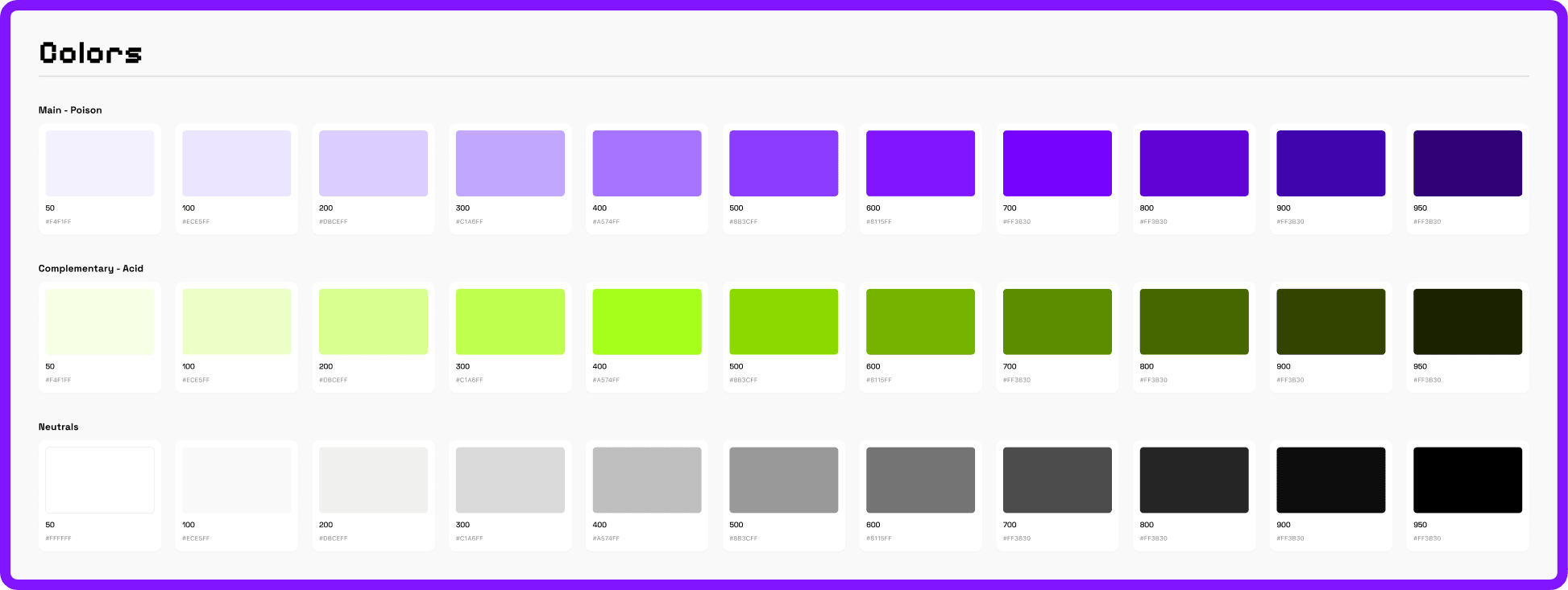
The design system is the part of this project I'm most proud of. Two color scales, Poison (purple) and Acid (chartreuse green), plus a neutral ramp. A pixel-art icon set with filled and outline states. A full component library covering stat bars, nudge cards, buttons, toggles, nav items, and session screens, all built with multiple states and enough variants to actually be useful.
The pixel grid came from early JRPG menus (Final Fantasy, Stardew Valley) initially. I wanted to capture that chunky, tactile feel where every element looks like it has weight. The stat bar is the anchor component: it glows when low, fills when you complete a session, and carries most of the emotional feedback in the app. Buttons have a satisfying press state. Everything bounces a little. The goal was for the UI to feel responsive and alive without being loud about it.
Below is a live look at some of the components. The stat bar pulses, the nav is interactive. None of it goes anywhere, it's just to show the micro-interactions in action.

04 · UI
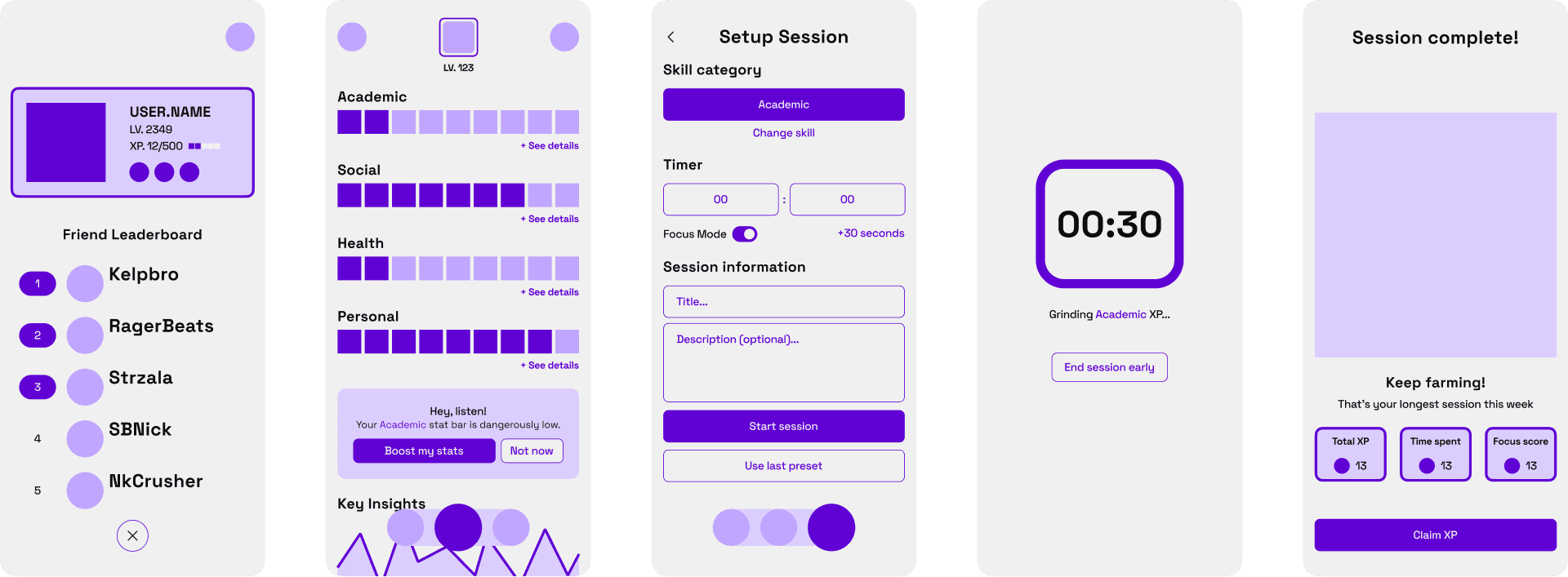
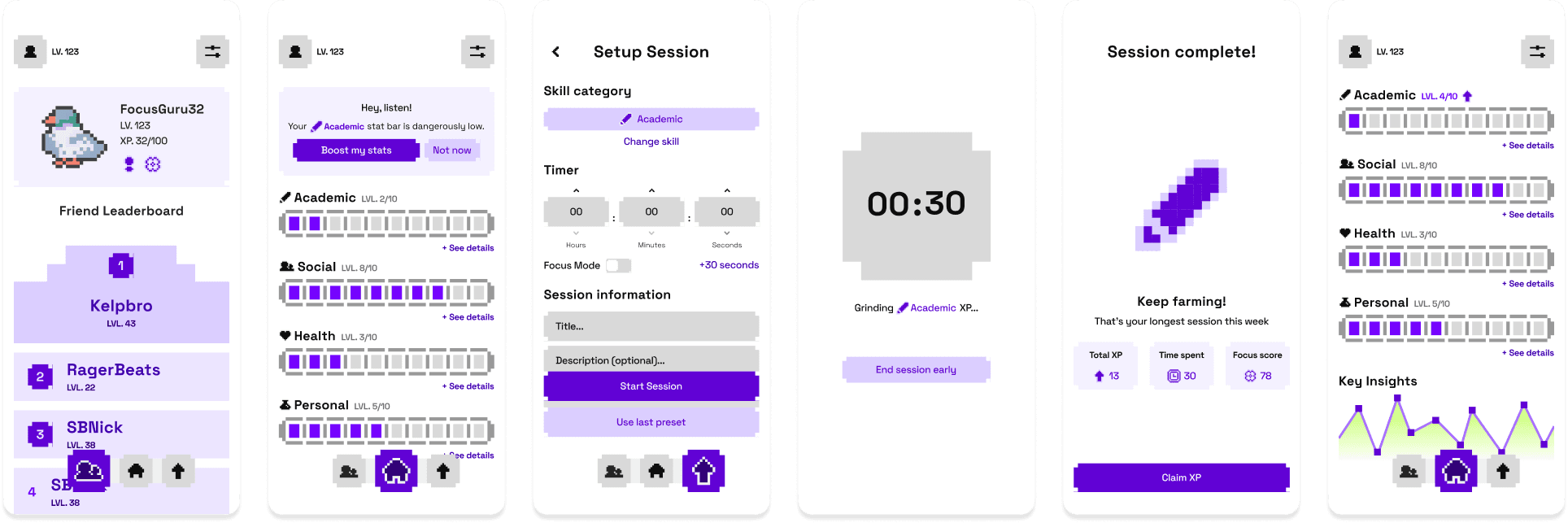
The hi-fi screens cover the full core loop: profile and leaderboard, dashboard with stat bars and nudge card, session setup, active timer, and the reward screen. The reward screen ("Session complete! Keep farming!") was one of the most satisfying things to design: the pixel lightning bolt animates in, and the XP summary gives you the three numbers that matter (Total XP, Time Spent, Focus Score) before you claim your reward and return to the dashboard with a slightly fuller bar.
The visual language leans hard into the game reference without tipping into parody. It's playful but it takes the information seriously. That tension is intentional.
Reflection
The design system is what I'd show someone first. The cute pixel icons, the bouncy components, all that stuff. I feel like it all hangs together in a super satisfying way, and I had a lot of fun building it. Two weeks is not a lot of time, and I think the aesthetic held up better than I expected, given that constraint. It’s not just another app design.
What I'd push further: the actual logic of the app. Some of the flows feel like they were designed for how the thing looks rather than how it would be used. The research was solid directionally, but it could go deeper (more user testing, a more fleshed-out persona spectrum, and earlier iterations before committing to the visual style). The app, as designed, is more of a flashy proof of concept for the design system than a fully thought-through product. That's not necessarily a bad thing for a two-week studio project, but it's the truth. The color system is barely utilized in full, the secondary color feels more like an easter egg than a feature (haha...).
More time in Figma staring at user flows. Less time (slightly) making things bounce perfectly.