

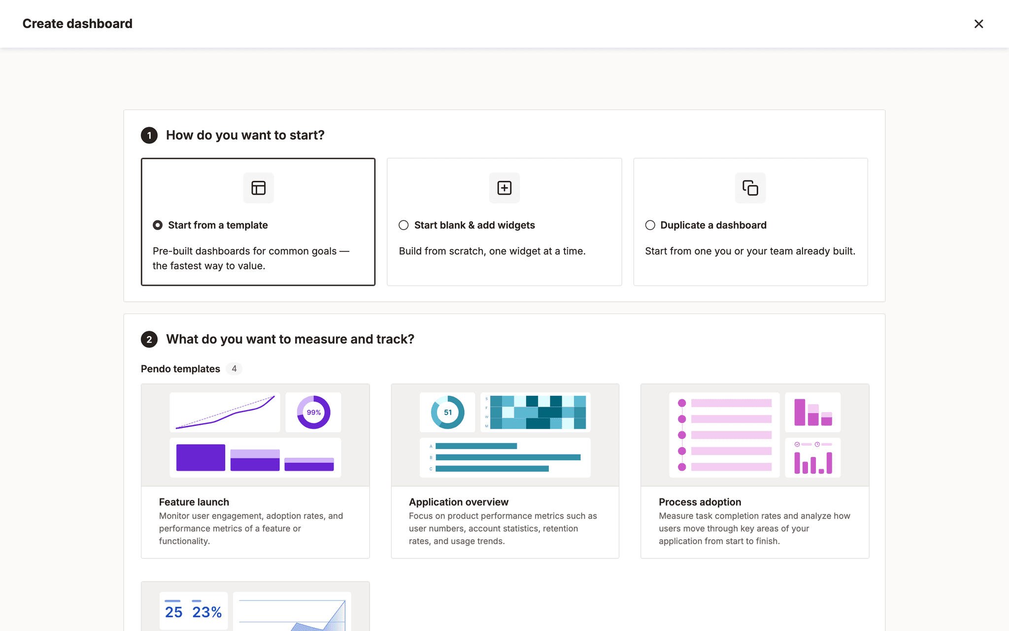
The build itself: the converged one-screen create, as sent to user testing
Dashboard Creation and the Widget Catalog
Pendo
2026
Overview
Pendo customers build dashboards to answer questions about their product. The step before that, deciding what to measure and finding the widget that measures it, was where they stalled.
I redesigned it. The work is now a roadmap epic broken into eighteen stories.
of sessions entering through the widget catalog completed, against 68.7% for dashboard entries generally. Median time was 3m33s against 1m44s
Product design intern, Team Flux. Roughly two weeks in July 2026, plus a user test in August. Solo designer, with a product manager and an engineering lead picking it up afterwards.
01 · Let the data pick the problem
I did not start from a hunch about the empty state. I pulled the real funnel through Pendo's own analytics, which is a slightly absurd advantage: the product measures product usage, so it can measure itself.
Choosing how to start
Two buttons, within 1% of each other every week for thirty days.
- Choose template1,450
- Choose widget1,43611 dead
- Duplicate dashboard480not offered in the empty state at all
Building it
The flow the redesign was scoped to, end to end.
- Add Widget clicked2,150
- Catalog interactions2,34413 dead1 rage
- Widget saved2,12058 dead18 error4 rageerror clicks here and at resize, nowhere else in the flow
After it is live
Where the traffic actually is, and where almost no design had gone.
- Edit widget settings11,70768 dead46 rage
- Widget settings date filter3,10828 rage
- Resize widget1,43551 errorinvisible constraints: snap grids and minimum sizes
- Duplicate widget439
Three numbers set the brief.
Roughly 40% of dashboard sessions enter through adding a widget, and that entry point converts worst. 61.2% against 68.7%, and it takes twice as long to get there.
About 78% of people never filter the widget catalog. Not "filter badly". Never open it. A catalog whose main navigation aid is ignored by four out of five people is not a filtering problem, it is a browsing problem.
People who save two or more widgets are retained around three times better at month six, 63.6% against 20.6%. A correlation, so it reads as a ceiling rather than a cause, but it puts a number on how much the first save matters. Duplicators retain 122% better on 439 unique visitors in 30 days, though that gap smells like selection bias: teams that copy a working dashboard were probably going to stick around anyway. Duplication was buried regardless.
Then the diagram above did something I did not plan for. It argued against my own brief.
more people edit a widget that already exists than save a new one, 11,707 against 2,120, on the part of the flow nobody had designed
The catalog was not the biggest problem. Editing was, and one date filter inside it drew 3,108 visitors and 28 rage clicks on its own. Below that, saving a widget carries 58 dead clicks and 18 error clicks. That is not a design preference, it is a reliability defect, and it sits on the exact action the retention number says matters most.
Resizing is worse, and I had this wrong the first time I wrote it up. It carries 51 error clicks on 1,435 visitors, close to three times the errors that saving produces, and the diagram names the cause: snap grids and minimum sizes that nothing on screen tells you exist. Saving and resizing are the only two steps in the whole flow that generate error clicks, and I had written that saving was the only one. Resizing is also the step nobody designed, in the phase nobody was scoped to.
So the recommendation I wrote was ranked, and it did not put my own project first. Fix the save button. Rebuild the empty state as a guided decision. Invest in widget settings, where the traffic actually is. Then improve catalog discoverability, fourth.
I still did the catalog work, because that was the piece that was mine to move. But the honest version of this project is not that I redesigned the catalog. It is that I mapped the whole flow, found the catalog was not the top problem, said so, and redesigned it anyway with that written down.
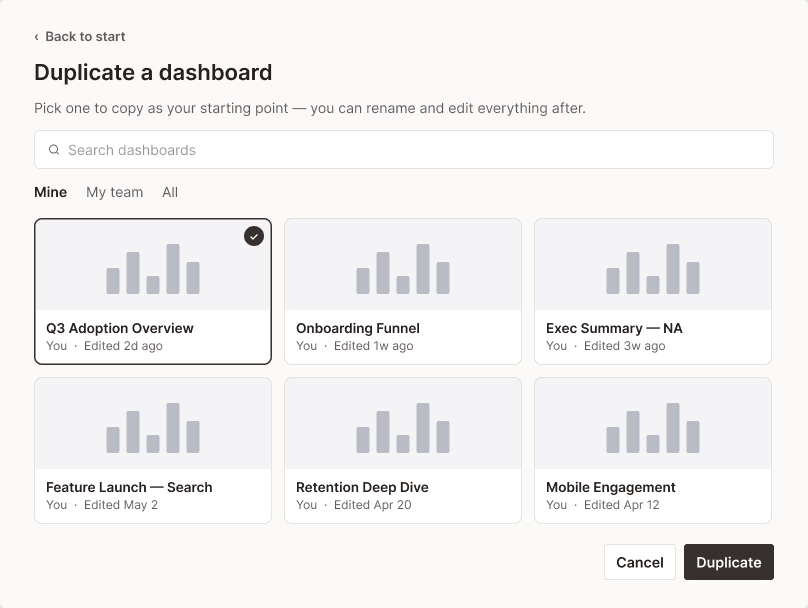
That first-class start had to be walked back. The duplication endpoint deep-clones a dashboard's widgets and mints new IDs, but it does not fork the saved report each widget points at, so editing a duplicate edits the original. Until the dashboards team confirms whether that is intent or defect, duplicate can only be an escape hatch, which is why it sits third of the three starts in the final design. The blocker lived in the API, not the UI.
Those three point the same way. The catalog was organised the way the system thinks about widgets, and people arrive thinking about a question.
02 · Three directions, then one
I built three divergent entry models rather than iterating on one, because the first idea is usually the existing idea with better spacing.
They converged on a single screen offering three starts, template, blank, and duplicate, in front of one question: what do you want to measure? Feature launch, application overview, process adoption, and AI agent engagement.
Leading with intent rather than widget taxonomy is the whole design. It moves the first decision from "which of these 40 widgets" to "which of these three things are you doing", which is a question people can actually answer on arrival.
The catalog itself got the same treatment. Widgets are grouped by the goal they serve rather than laid out as one flat wall sorted by data model: overview and key metrics, adoption, engagement, retention, user journeys, guides, feedback and sentiment, audience and environment, and layout and context. Nine groups, and the vocabulary is Pendo's own rather than invented for this screen. Each widget and each filter carries an icon, so the list can be scanned by shape instead of read line by line. That icon set is not invented for this screen: Leo's @ mention menu already uses most of them for the same entities, so the catalog borrows a vocabulary people have already met. And search stays as the fallback for anyone who arrives knowing the widget's name, because grouping helps browsing and does nothing for someone who already knows what they want.
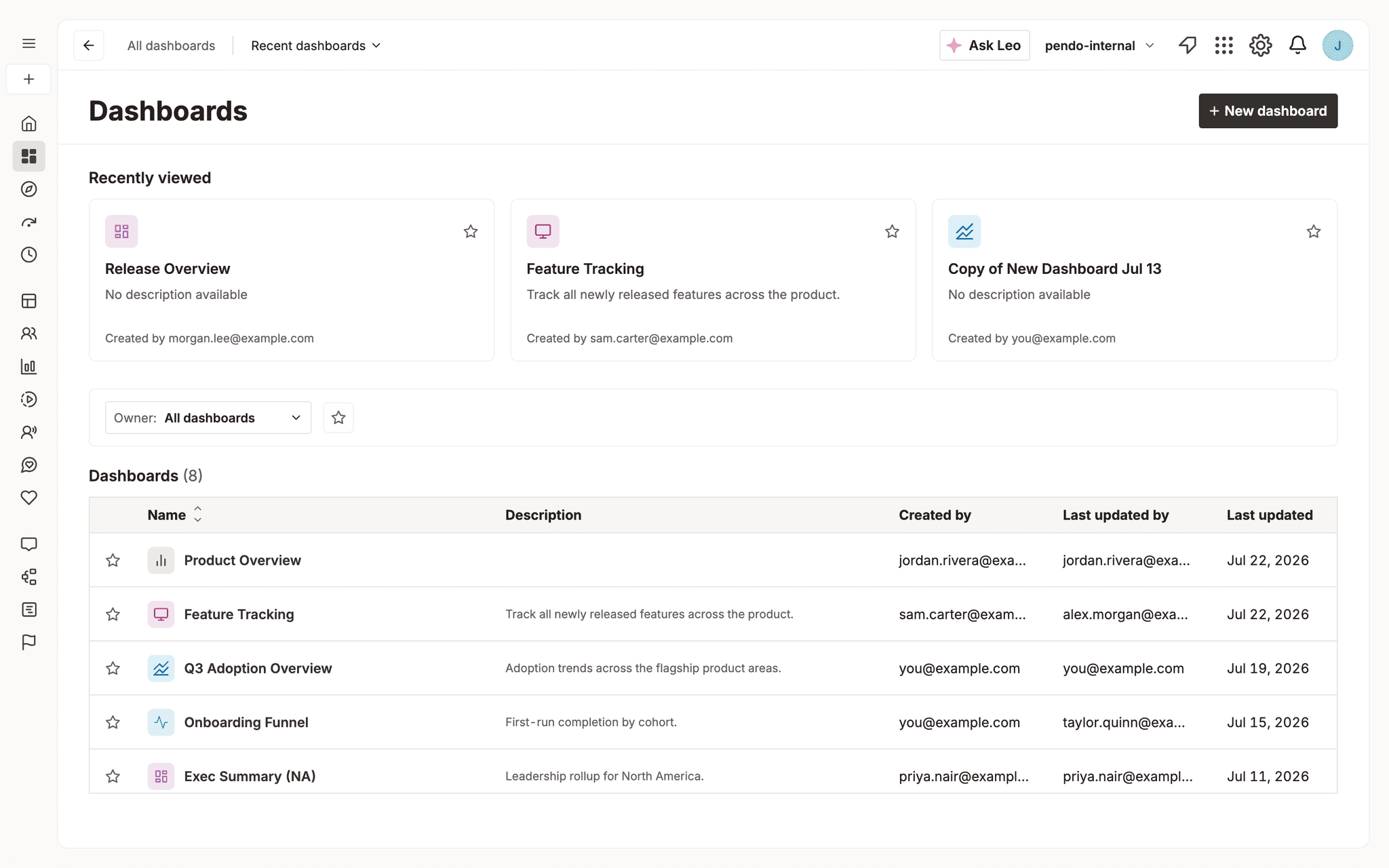
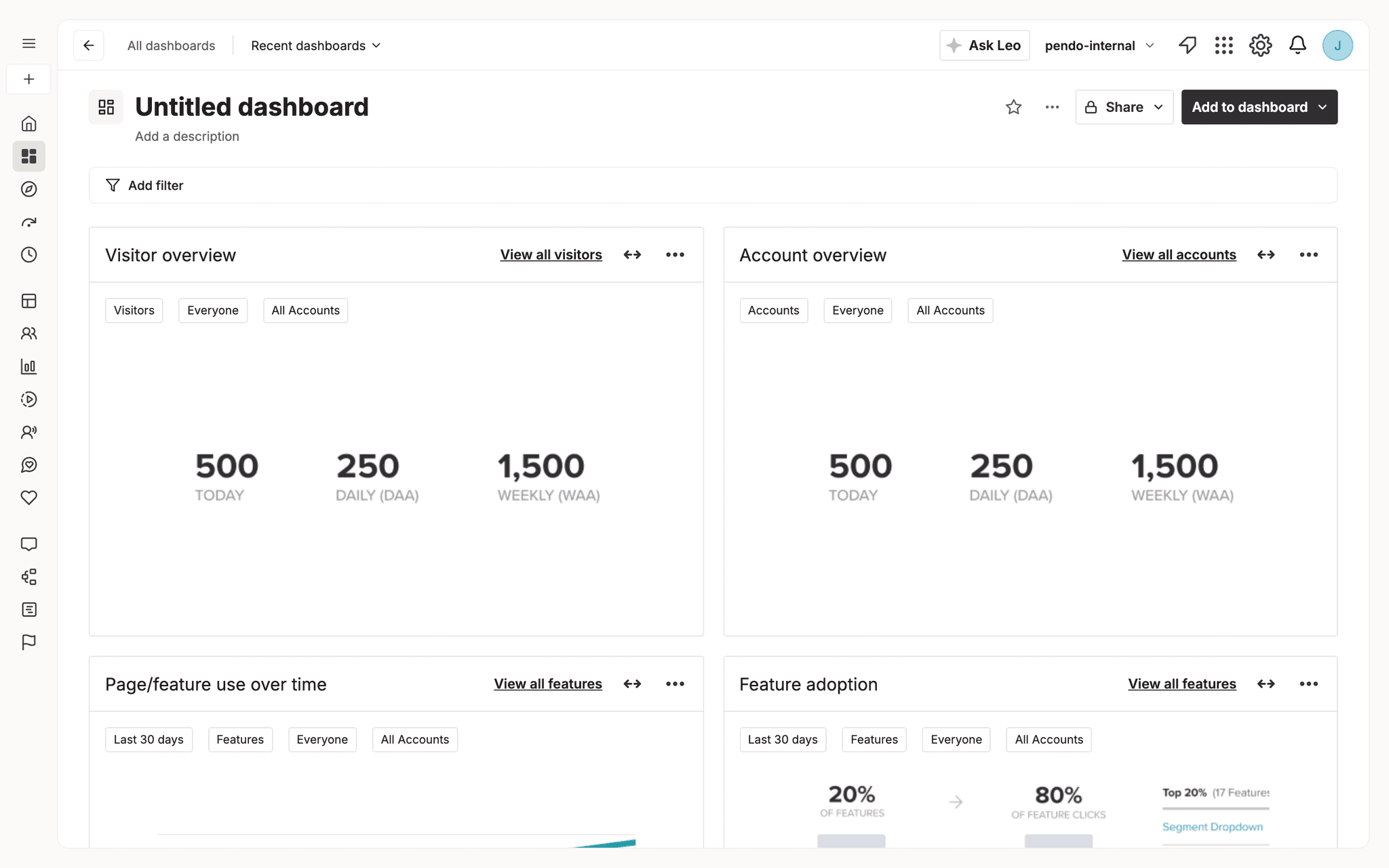
The early sketches, before anything was built. Kept because the distance between them and the working build above is the actual work.
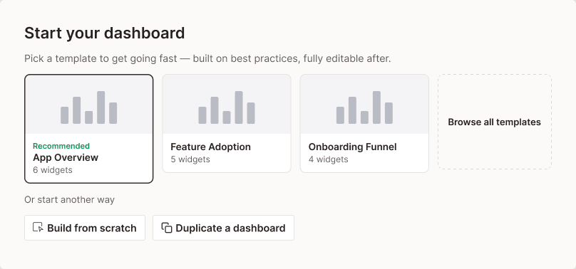
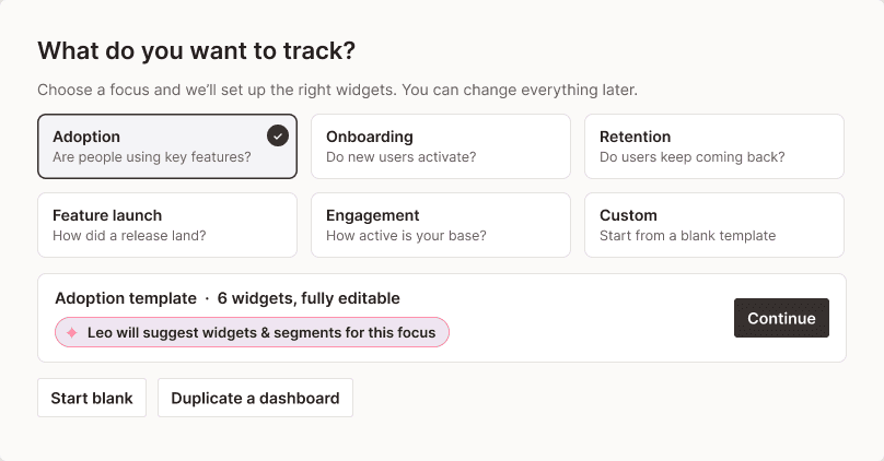
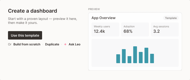
I was careful about one piece of copy. Leo, the AI assistant, helps you choose widgets. It does not build them. Writing it the other way would have been a better sentence and a promise the product could not keep.
That sentence is the residue of two directions that are not in the pictures above, and they were the most interesting ones I built. In the first, you describe what you are trying to understand and Leo points you at the widget that answers it, then pre-fills its setup. In the second, an Ask Leo callout opens the real conversational rail alongside the catalog, Leo recommends actual widgets, and a Set up button hands off to the config step so the loop closes.
Neither is going forward, and the reason is not that they tested badly. Leo cannot do this yet. The capability is real work that other teams are actively building toward, and designing a flow whose whole value depends on a recommendation quality that does not exist yet is how you ship a demo. So the browse and choose model is what I put my weight behind: it is worse in the best case and much better in the case the product is actually in. The two Leo directions stay in the sandbox, ready for when the thing underneath them is real.
Underneath the flow-level directions there was a second, smaller argument about one surface. The shipped empty state offers two identical 360px cards with two identical buttons, which is the product asking a question it has no opinion about. It was also hand-rolled out of plain divs rather than the design system's own empty-state component, and the path a good number of people actually wanted, duplicating a dashboard they already have, was not on it at all.
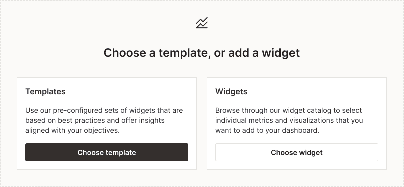
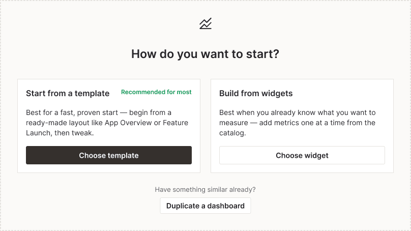
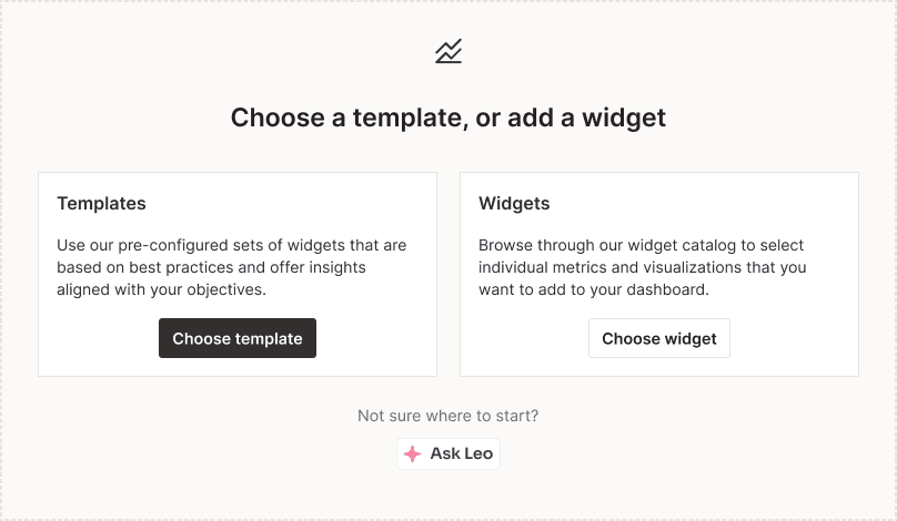
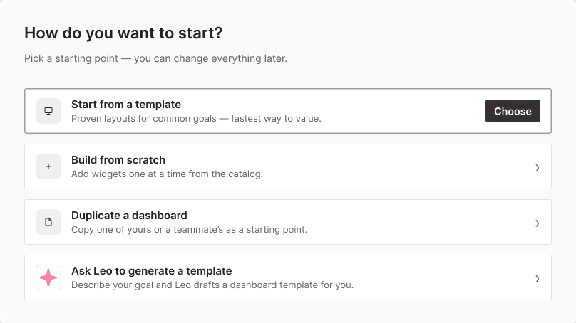
These exist to argue about hierarchy, not about wording. Every one of them could carry the same sentences; what changes is what the page thinks you should do. That distinction is worth stating out loud, because "the copy is confusing" was the complaint that started it, and rewriting the copy would not have fixed a layout that gives two options identical weight.
They were also built, not just drawn. Today's baseline sits at the top of one running page with five reworked options under it, on the real components, so the comparison is a thing you scroll rather than four pictures you hold in your head. Three of those five are the same option arguing with itself about one interaction: how you pick the dashboard you are duplicating. As a modal, as a popover with tabs scoped by who owns the dashboard, or folded into a guided flow. That is more attention than a secondary path deserves, except that the secondary path is the one the funnel says 480 people a month go looking for and do not find. This one never went to a user test. It went to the team, and it stalled on engineering lift.
The version I recommended was the compact one, and the reason was structural. Three buttons sitting in one row still read as peers no matter which one is filled in darker, so the hierarchy had to come from the arrangement rather than from button colour. One correction I got wrong first and had to walk back: I drew a coloured border around the recommended card, and the real component library uses a tag and a hover shadow for that, never an outline. A persistent coloured border already means selected elsewhere in the product, so on a screen where nothing is selected yet it is a small lie.
There is a governance beat here too, and it is not flattering. The option I wrote up as the recommendation is not the one that went into the user test. That happened for reasons that were real at the time and were never written down, so I reconstructed them afterwards from memory. The design decisions are all documented. The decision about which design to test was not, and that is the one that changed the result.
The reach is bigger than one screen. The same equal-weight card pattern is not unique to dashboards: it powers around eight other upsell pages plus onboarding, out of one shared component. Fixing it here is a component fix everywhere, which is what "rethink the component" was actually asking for.
03 · The user test did not work
Three unmoderated sessions, comparing the one-screen merge against the empty state. The honest summary is that it cannot answer the question it was built to answer, and I wrote that at the top of the findings so nobody downstream could cite it as if it could.
It failed for reasons that were my fault, and they are worth more than a clean result would have been.
The one thing I did get right was the control. Both flows open on the same entry screen and finish on the same completed dashboard, so the create model is the only variable between them. That part was deliberate, and everything below is what I put around it.
Both flows share an identical entry screen, so showing one participant both reads as a repeat rather than a comparison. One of them said it outright: they assumed they were back at the beginning looking at the exact same thing.
The entry list was deliberately non-interactive placeholder content. In an unmoderated test that is a trap, and it swallowed an entire session. One participant spent the whole thing trying to click things that were never wired up.
Worst, the task competed with the thing being tested. The prompt asked participants to understand how a newly launched feature was being adopted, and I had pre-seeded the list with dashboards named "feature tracking" and "release overview". Opening one of those is the correct response to that setup. Two of three did exactly that, which means they behaved sensibly and the test was wrong.
Usable observation of the actual create flow: one participant.
The exact build those three participants saw is still runnable. Both flows are below, live. Open one, click through it, and you are looking at the same thing they were.
04 · What it did support
Non-comparative, but real, and it changed the roadmap.
Templates landed, and for the reason the epic had assumed. One participant volunteered the org-consistency argument without being prompted: having templates means their team and org get a similar look, so people know what to expect instead of building from scratch every time. That is the argument for ranking template first, made by a user rather than by me.
There was a competitive quote too. On another analytics tool, this person has to create an event, then a chart, then add it to a dashboard. Here they could start a dashboard immediately. That endorses create-then-guide over an event-first model.
And the flow stalled in exactly one place, which turned out to be a real product gap rather than a prototype limitation: a feature-adoption widget cannot be scoped to a single feature. They saved it, looked at it, and could not work out how to ask about the feature they cared about.
The interviews were not the only voice on this. Survey and portal feedback ran alongside the funnel, and it kept describing the same shape the numbers had: not "I cannot find a widget" but "getting a dashboard built costs more than it should".
Features are there, but the actions and steps needed to create a simple dashboard are all over the place, and I spend more time than needed creating a proper dashboard. As of recently I just stopped bothering, and I am using Claude Code with MCP and API key to fetch the data and generate reports.
Enterprise healthcare customer, NPS survey, March 2026
I would put that one in front of anybody who thinks this is a discoverability project. It is not churn to a competitor, it is a customer routing around the interface entirely and going to the API with an AI tool, because assembling the dashboard by hand was the expensive part. Every step they are describing is on the diagram above.
The empty state's problem shows up in customers' own words too, and it is not confusion about what the buttons say:
Still learning and have just now launched our first Resource Center... still don’t know how to make Dashboards that make sense and I feel like maybe we set things up incorrectly.
Coaching and training customer, NPS survey, February 2026
That is the 1,450 against 1,436 split with a voice attached. Somebody standing in front of two equally weighted options, picking one, and coming away unsure they picked right.
And the part I did not design for is the part with the most specific complaints. These are all about adding widgets to a dashboard that already exists:
Be able to select multiple widgets to add to a dashboard simultaneously. It’s tedious to select a widget, be directed to the dashboard, go back to the widget list, etc.
Healthcare software customer, support portal, September 2025
Too many clicks to add more widgets. Instead of scrolling to top, add widget, search for the widget, add the widget, move the widget (Oy).
Media and events customer, support portal, August 2025
Both of those describe the same loop, and it is the loop the funnel says is 5.5x the size of the one I was scoped to. Everything above is about creating a dashboard. Adding widgets to one that already exists is a different flow, and it was never part of the brief.
I built it anyway, because the numbers made it hard not to. Multi-select with a running count, so adding four widgets is one trip instead of four. Three models for what happens after you pick, configure each in place, walk a setup wizard, or drop them in with defaults and fix them later. It went to the team with the rest and stalled on the same lift.
So the gap here is not that the flow does not exist. It is that the 5.5x number never moved anything: the biggest slice of this problem is still the one nobody has been staffed to fix.
Reflection
The result I would most like to report is that the A/B test picked a winner. It did not, because I designed it badly in three specific ways, all of which are written down with fixes.
What the work produced instead is a roadmap epic, APP-164817, scoped into eighteen stories with the first slice starting the following sprint. The product manager's summary was that the team would plan it out the next week. A colleague circulated the build to a technical collaboration channel for wider feedback.
The measurable thing is that it moved from a designer's prototype into someone else's sprint plan. That is the outcome I would defend, and it happened despite the test rather than because of it.