Moon Flag
Design, Context, and Experience
2023
Overview
The brief was to design a flag for anything. I picked the moon, which meant there was no existing symbol set to inherit and nothing to modernise, so the first work was deciding what the flag was allowed to mean before drawing any of it.
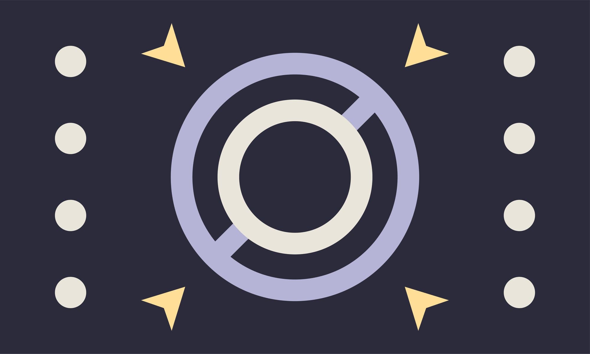
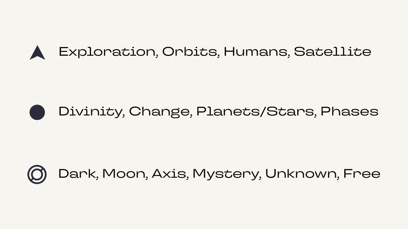
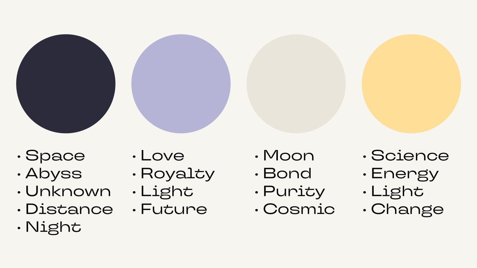
That took two pages. One assigns a meaning to each glyph the flag can use: the arrow for exploration, orbits, humans, satellite; the dot for divinity, change, planets and phases; the ring for dark, moon, axis, mystery, unknown, free. The other fixes four colours and the words each one carries. Every flag below is drawn against those two pages rather than against taste, which is why the rejected ones fail for reasons you can name.
Nine Flags
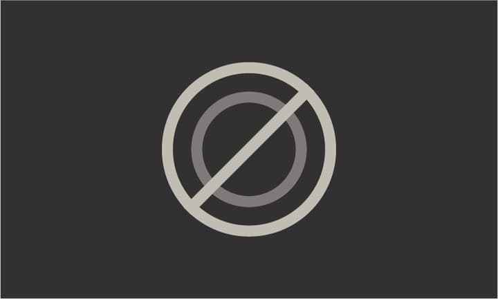
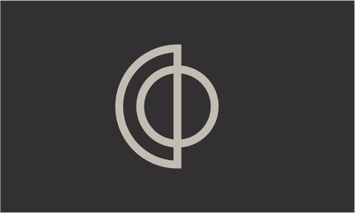
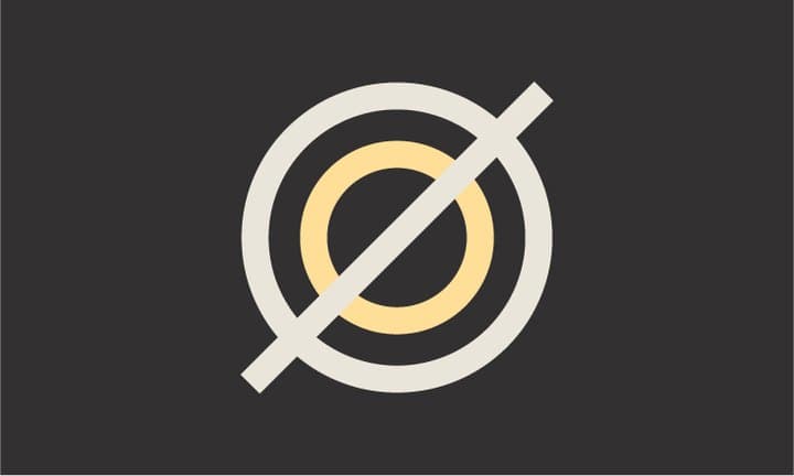
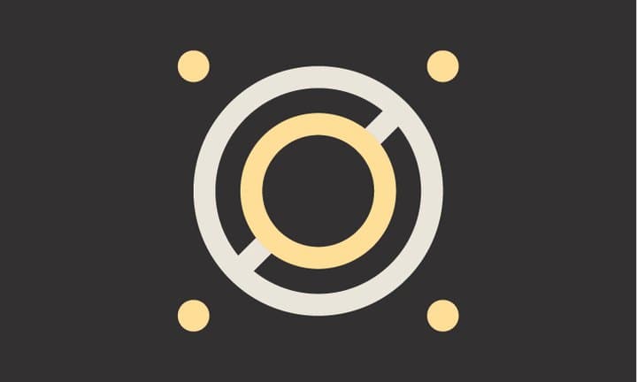
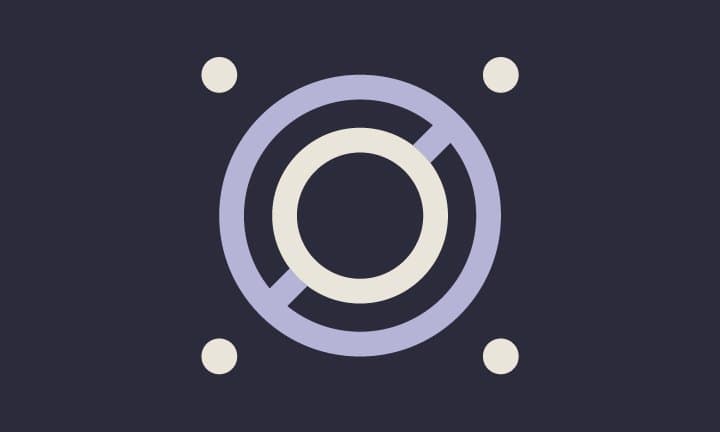
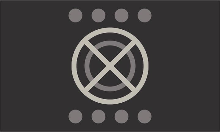
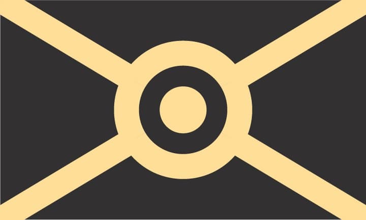
Most of the sheet goes on one question: how much can hang off the slashed ring before it stops being a mark. Colour arrives, then the dots, then the whole thing flips palette. The last two test whether the ring is needed at all, opening it into a saltire, which reads as a flag much faster and as the moon much less.
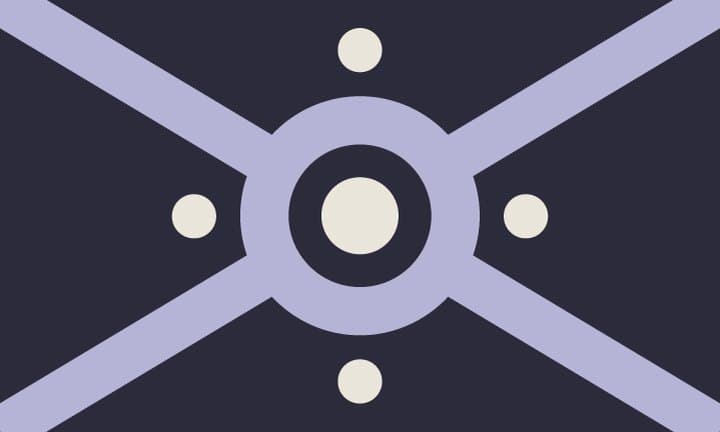
The Flag
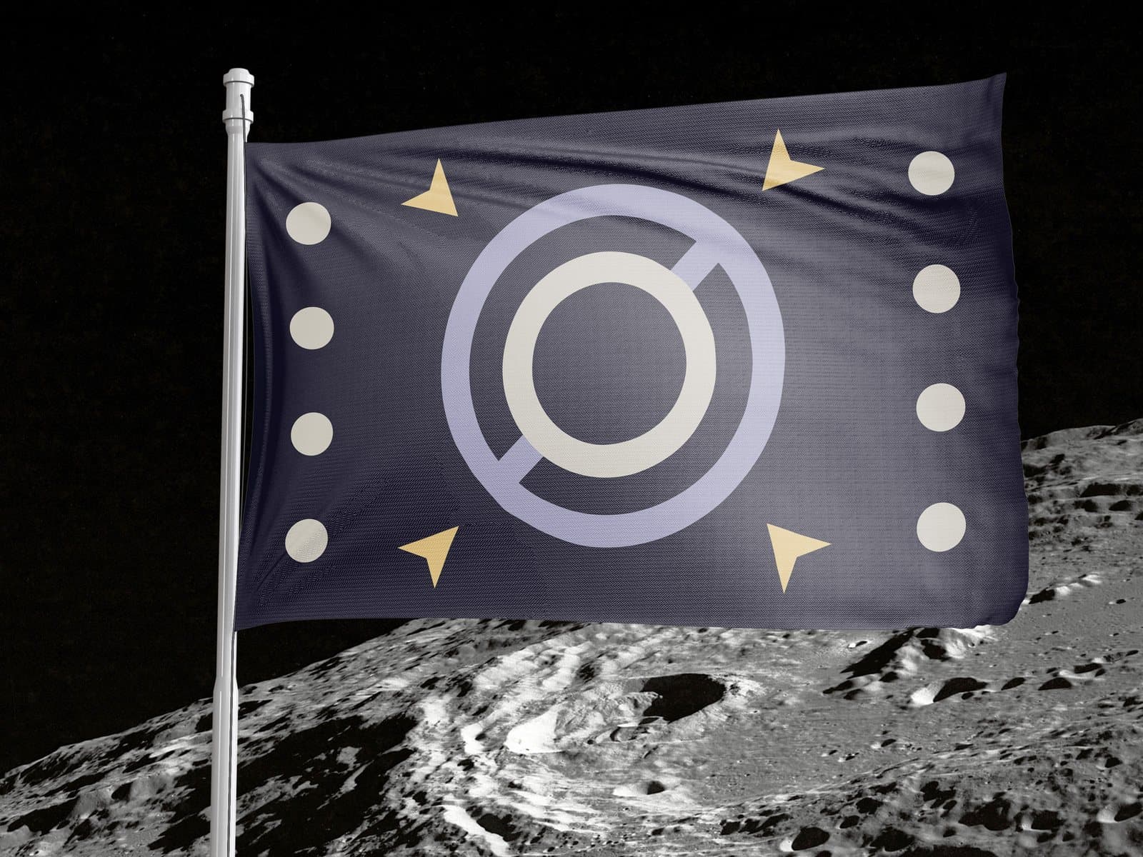
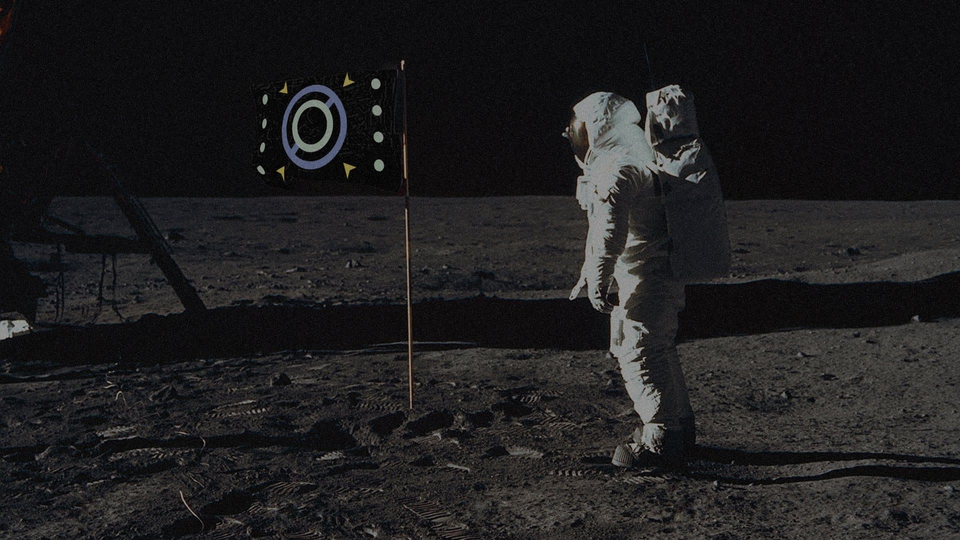
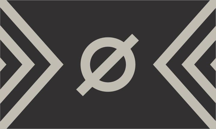
The one that stayed keeps the slashed ring and spends everything else on the legend: four dots up each side for the phases, four arrows angled out from the centre for exploration. Nothing on it is decoration, which is the only test the sheet above was ever applying.