
4MAT
Student club, never launched
2025
Overview
4MAT was going to be a club that ran like an agency. Nick's idea: put computer science, graphic design and industrial design majors in the same room and have them ship something that actually gets built, instead of another semester of work that stops at the presentation. I did the branding.
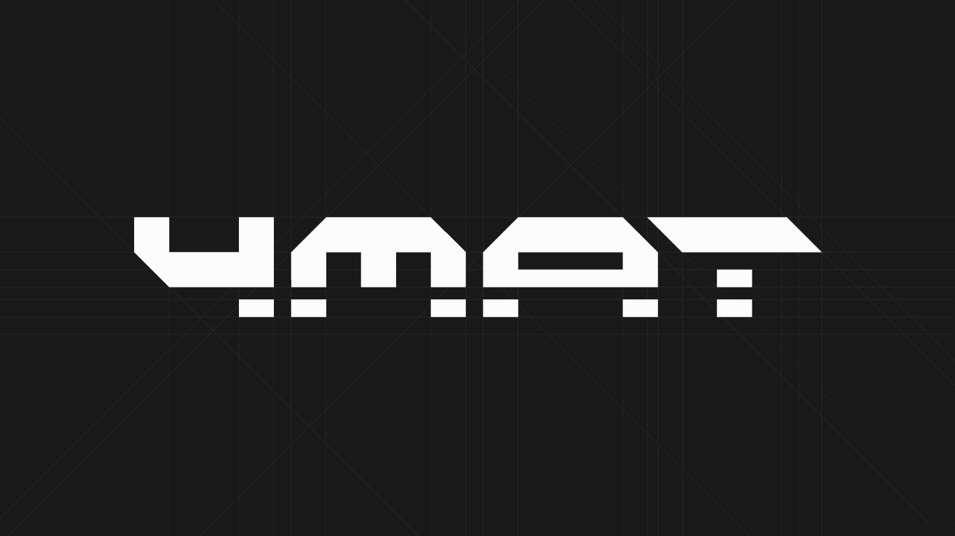
The name is the joke. Format, four, 4MAT. So the wordmark is built out of blocks on a grid, and it stacks, runs flat, or turns on its side without being redrawn.
It lasted a couple of months. There were some conflicts, and it was everyone's last semester, so we ran out of time before anything got built. Fun experience, made new friends, and got a cool brand concept out of it.
#bringback4mat
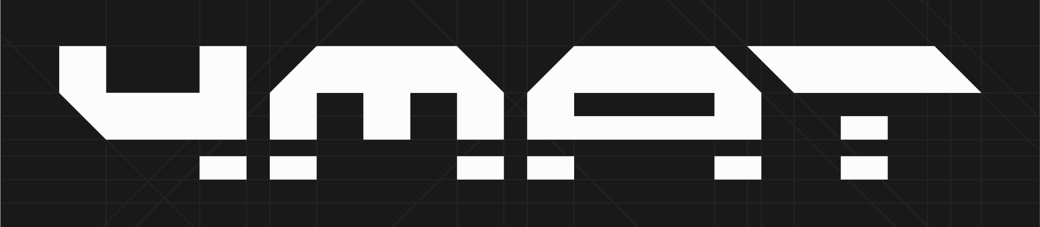
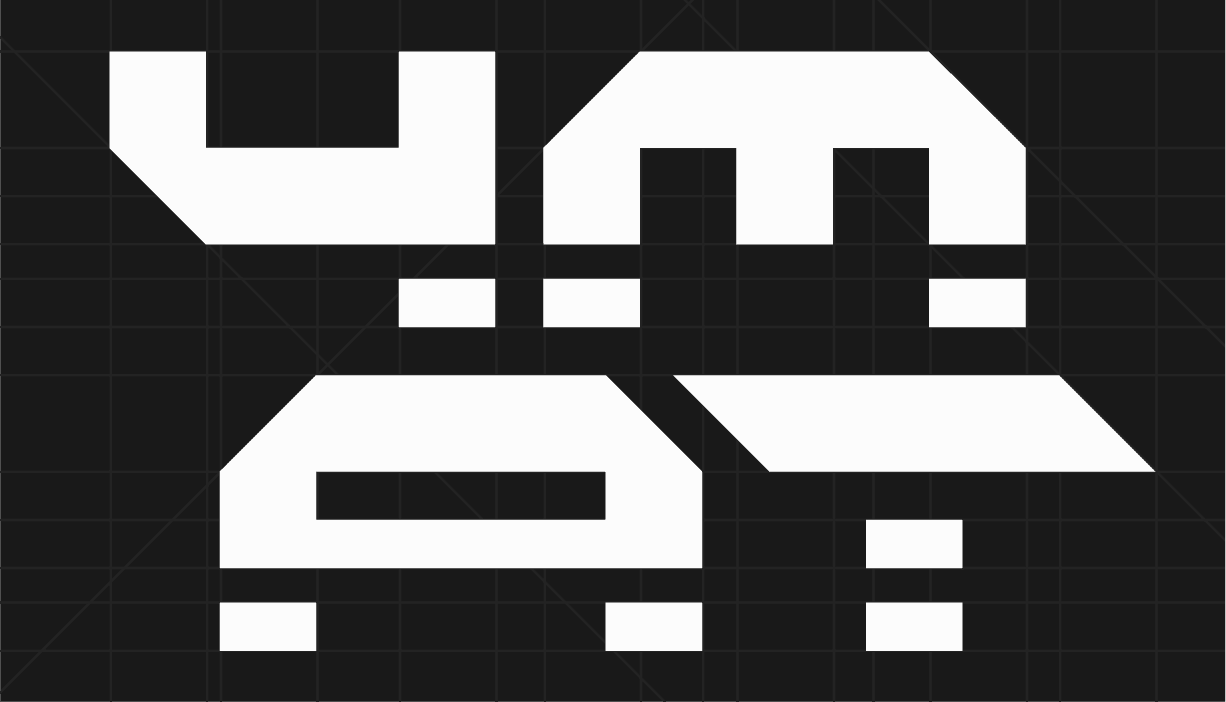
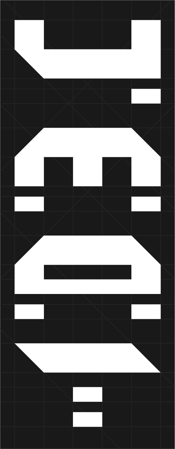
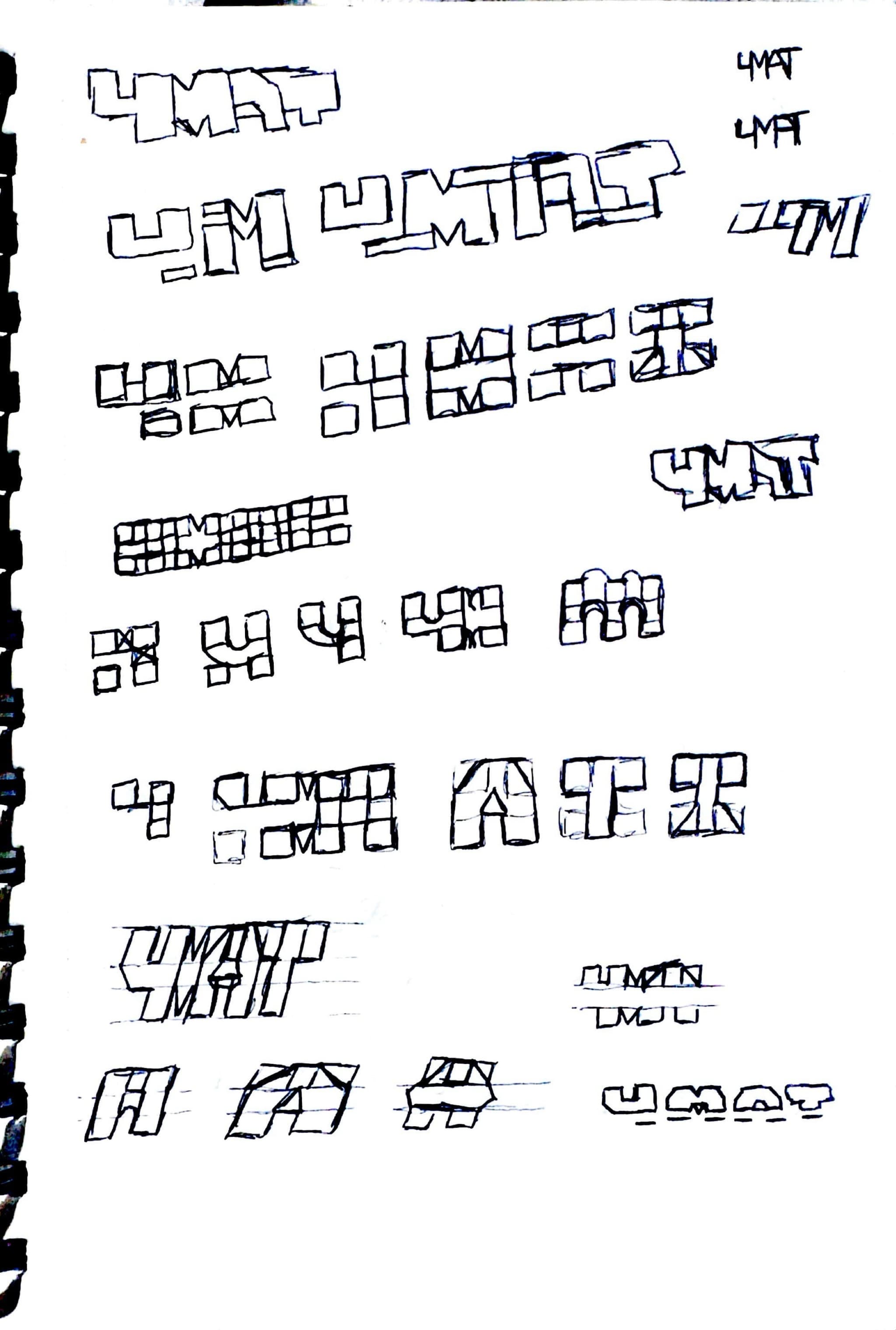
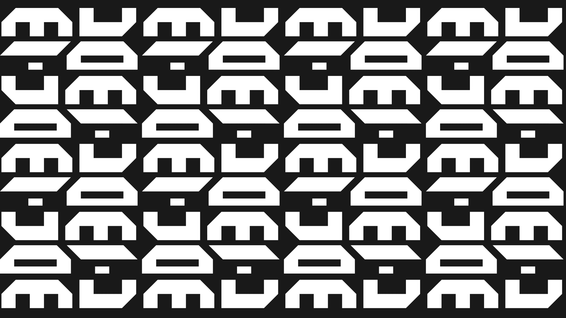
The letters tile. Set edge to edge they stop reading as a name and turn into a field, which is where the pattern came from.
Process Work
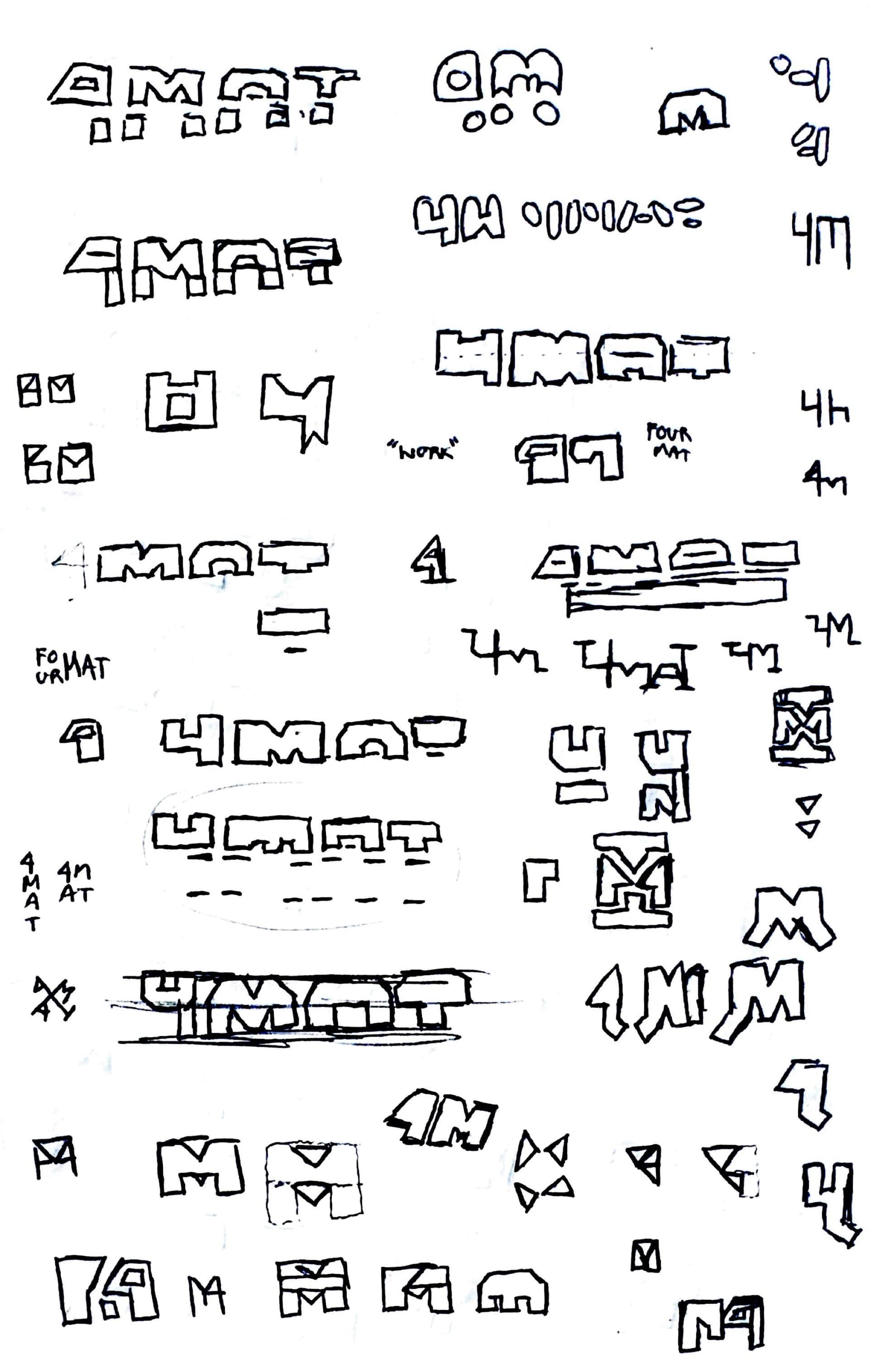
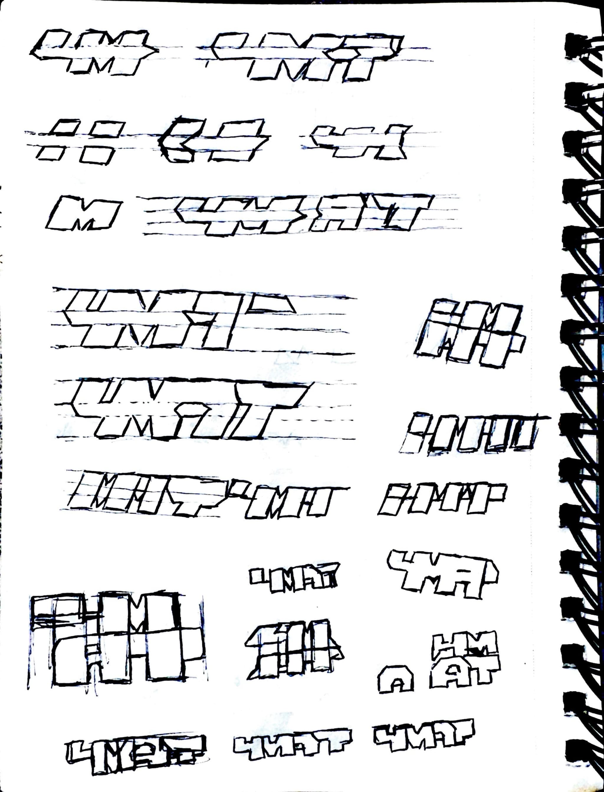
Three pages of trying to draw the pun before settling on it. FOUR MAT, FO/UR MAT, "work", 4M, 4MAT. Most of them are the same idea at different weights, and the ones that survived are the ones drawn on a grid rather than freehand.